Mizan UX case study
A dual-currency bank for Lebanon, from research to final design: problem, personas, journey map, user flows, information architecture, wireframes, UI and usability testing.
- Role
- UX/UI designer
- Year
- 2025
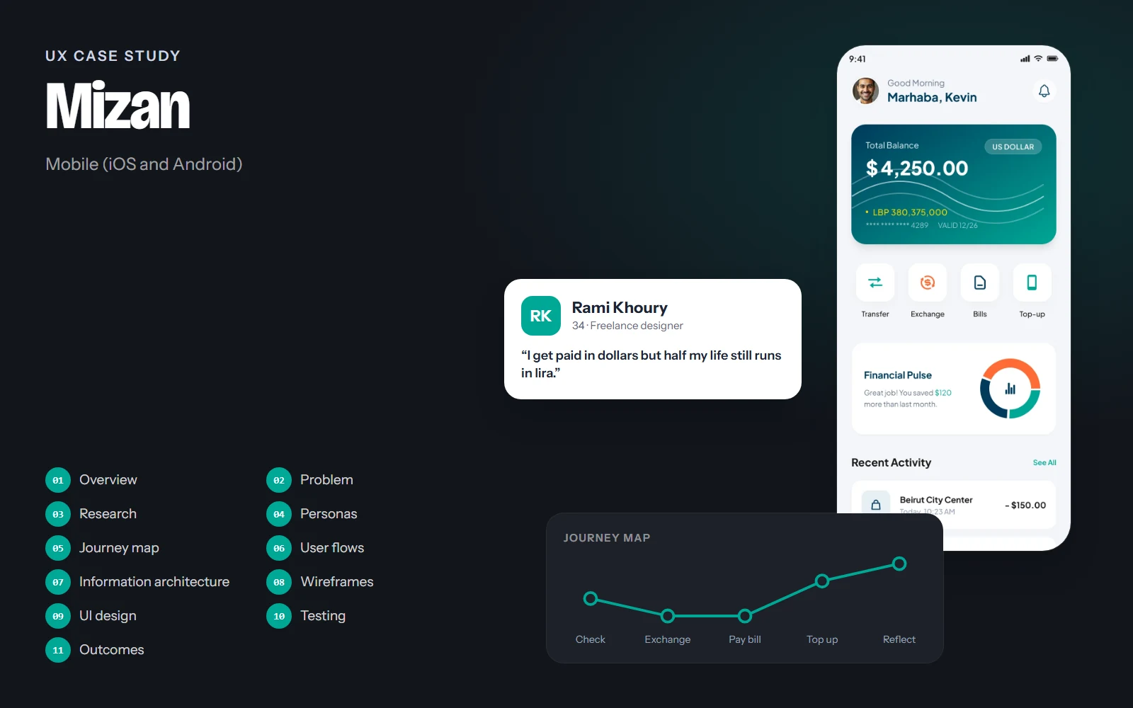
The screens, flows and structure on this page come from the real Mizan design. Research findings, personas' quotes, test results and numbers are illustrative examples of how I run each step; they are marked Illustrative and are not data from a real study.
01Project overview
Background
In Lebanon most people manage two currencies at once: salaries, savings and many prices are in US dollars, while some bills, fees and everyday purchases are still in Lebanese pounds. Banking apps usually treat this as an edge case, so people keep mental notes, screenshots and calculator apps open to stay on top of their money. Mizan is a mobile bank designed around that dual-currency reality.
Objectives
- Show both balances (USD and LBP) clearly, without making people convert in their heads.
- Put the everyday tasks (transfer, exchange, bills and top-up) one tap from home.
- Make every money movement easy to check before it happens: rate, fee, total and arrival.
- Design light and dark themes from one set of tokens, with equal contrast in both.
Challenges
- Exchange rates change often, and people distrust rates that appear only at the last step.
- Users range from freelancers paid from abroad to parents topping up their kids' phone lines.
- Banking needs to feel secure and calm without feeling cold or complicated.
Project at a glance
- Role
- UX/UI designer
- Platform
- Mobile app
- Screens
- 9, in light and dark
- Deliverables
- Research, flows, wireframes, UI kit
- Tool
- Figma
02Problem statement
Problem statement
People in Lebanon who live with both dollars and lira need to see, move and exchange their money with confidence, but most banking apps hide one currency, show rates too late and bury everyday tasks under menus.
The result is hesitation at the exact moments that matter: before sending money, before exchanging, and before paying a bill. Mizan's job is to remove that doubt by making the numbers visible and the next step obvious.
How might we…
- …show two balances at once without clutter?
- …make the exchange rate and fees clear before people commit?
- …keep bills and phone top-ups from being forgotten at the end of the month?
03UX research
Target audience
Adults in Lebanon aged 22–60 who hold money in both USD and LBP: salaried employees, freelancers paid from abroad, and parents who manage household bills and their family's phone lines.
Competitive review
Compared local and regional banking and wallet apps on balances, transfers, exchange and bill payment.
User interviews
Short interviews planned around one question: what do you check before you move money, and why?
Task walkthroughs
People talk through how they pay a bill or top up a phone today, step by step, including the workarounds.
Key insights
Illustrative findingsINSIGHT 01
Two balances, one decision
People think in dollars but still pay some things in lira. Seeing both side by side matters more than a converter.
“I always open the calculator before I pay anything.”
INSIGHT 02
The rate must come first
Seeing the rate only on the confirmation screen feels like a trick, even when it's fair.
“Show me the rate before I type the amount.”
INSIGHT 03
Top-ups are a family task
Parents often top up several lines (their own and their children's) on Alfa or Touch, usually at the end of the month.
INSIGHT 04
Review beats speed
People prefer one clear review step over a fast, one-tap send. Confidence matters more than seconds saved.
04User personas
Rami Khoury
Primary34 · Freelance designer · Beirut
“I get paid in dollars but half my life still runs in lira.”
Rami works with clients abroad and is paid in USD. He pays his rent in dollars, his generator and some bills in lira, and often helps his parents with transfers.
Goals
- Know at a glance how much he has in each currency
- Exchange at a fair, visible rate
- Pay bills before the due date without thinking about it
Frustrations
- Rates shown only at the last step
- Switching between apps and a calculator
- Unclear fees on transfers
Habits
- Checks his balance every morning
- Pays most bills at the end of the month
- Uses dark mode in the evening
Nadine Haddad
Secondary52 · Schoolteacher and mother of two · Zahle
“I just want to be sure I didn't send the wrong amount.”
Nadine manages the household budget, tops up her children's phone lines and pays the internet and electricity bills. She is careful and double-checks every step.
Goals
- Top up several phone lines quickly
- See upcoming bills and due dates in one place
- Feel safe that nothing goes out by mistake
Frustrations
- Small text and crowded screens
- Not knowing which account will be charged
- Confirmations with no summary
Habits
- Tops up lines on the 1st of each month
- Prefers light mode and large numbers
- Asks her son for help with new apps
05User journey map
Rami: it's the end of the month and he needs to exchange some dollars, pay his internet bill and top up his phone.
Doing
Opens the app to see what he has in USD and LBP.
Thinking
“Do I have enough lira for the bills, or do I need to exchange?”
Pain point
Most apps show one currency at a time.
Opportunity
Balance card with USD large and the LBP balance right under it.
Select a stage, or a face on the curve, to see what the person is doing, thinking and feeling.
06User flows
The main paths through the product, from the first tap to the goal. Decisions show where the path can branch.
Goal: Send $250 to a person's bank account and know exactly what will arrive.
- Open Mizan
- Home
- Tap Transfer
- Transfer details
- Enough USD?No: exchange from LBP first
- Review fee and total
- Confirm with Face ID or PIN
- Transfer sent
07Information architecture
Home
- Balance card (USD + LBP)
- Quick actions
- Financial Pulse
- Recent activity
Move money
- Transfer
- Exchange
- Bills
- Mobile top-up
Cards
- Card controls
- Freeze card
- Card details
- Manage PIN
- Spending limit
Analytics
- Monthly spending
- By category
- Compared with last month
Activity
- Search
- Money in / out
- Grouped by day
Profile
- Personal information
- Security & privacy
- Notifications
- App preferences
- Help
The bottom bar holds Home, Cards, Analytics and Profile, with a central scan button. The four money tasks live on Home as quick actions, so they are always one tap away.
08Wireframes
Low-fidelity layouts came first, to agree on structure and priorities before any colour or type.
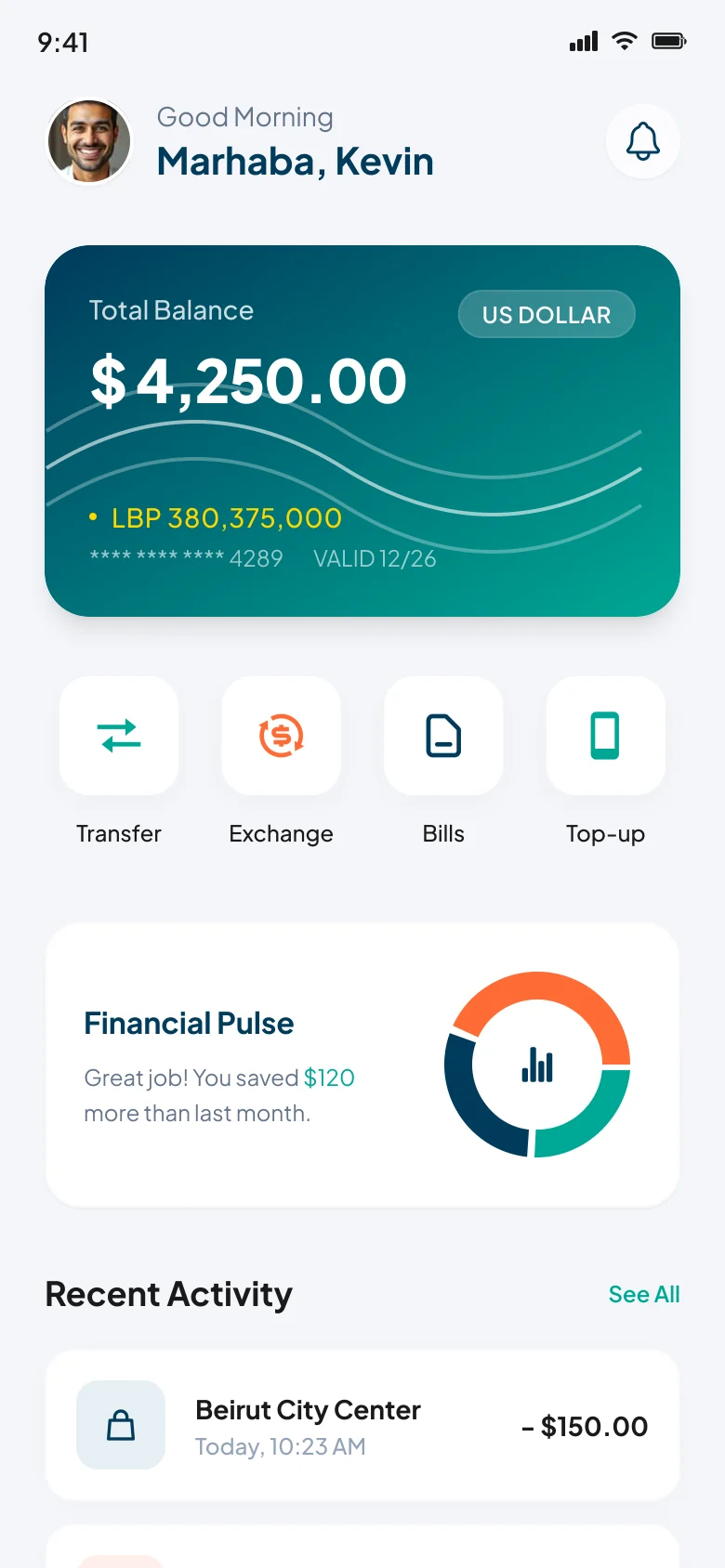
Annotations
- 1One balance card shows USD large and LBP underneath, so nobody has to convert.
- 2Four quick actions for the tasks people do every week.
- 3A single friendly insight instead of a dashboard of charts.
- 4Recent activity confirms that the last action went through.
Drag across the screen to go from the low-fidelity sketch to the final design.
09UI design
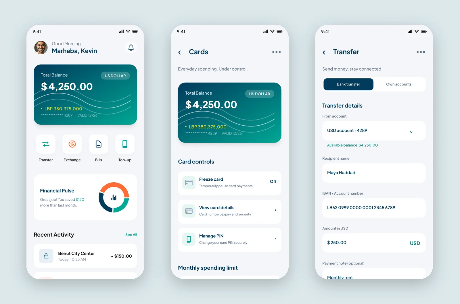
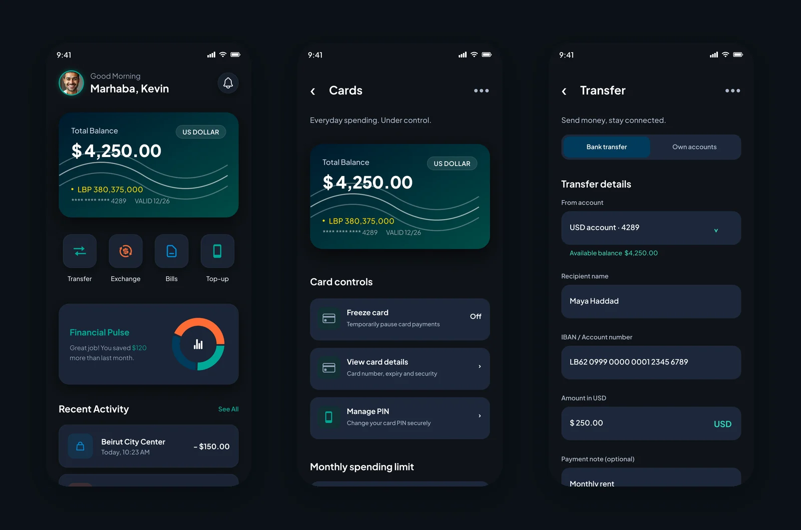
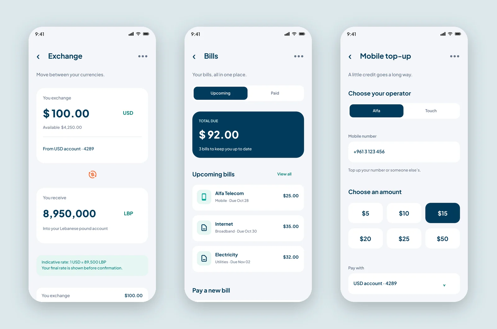
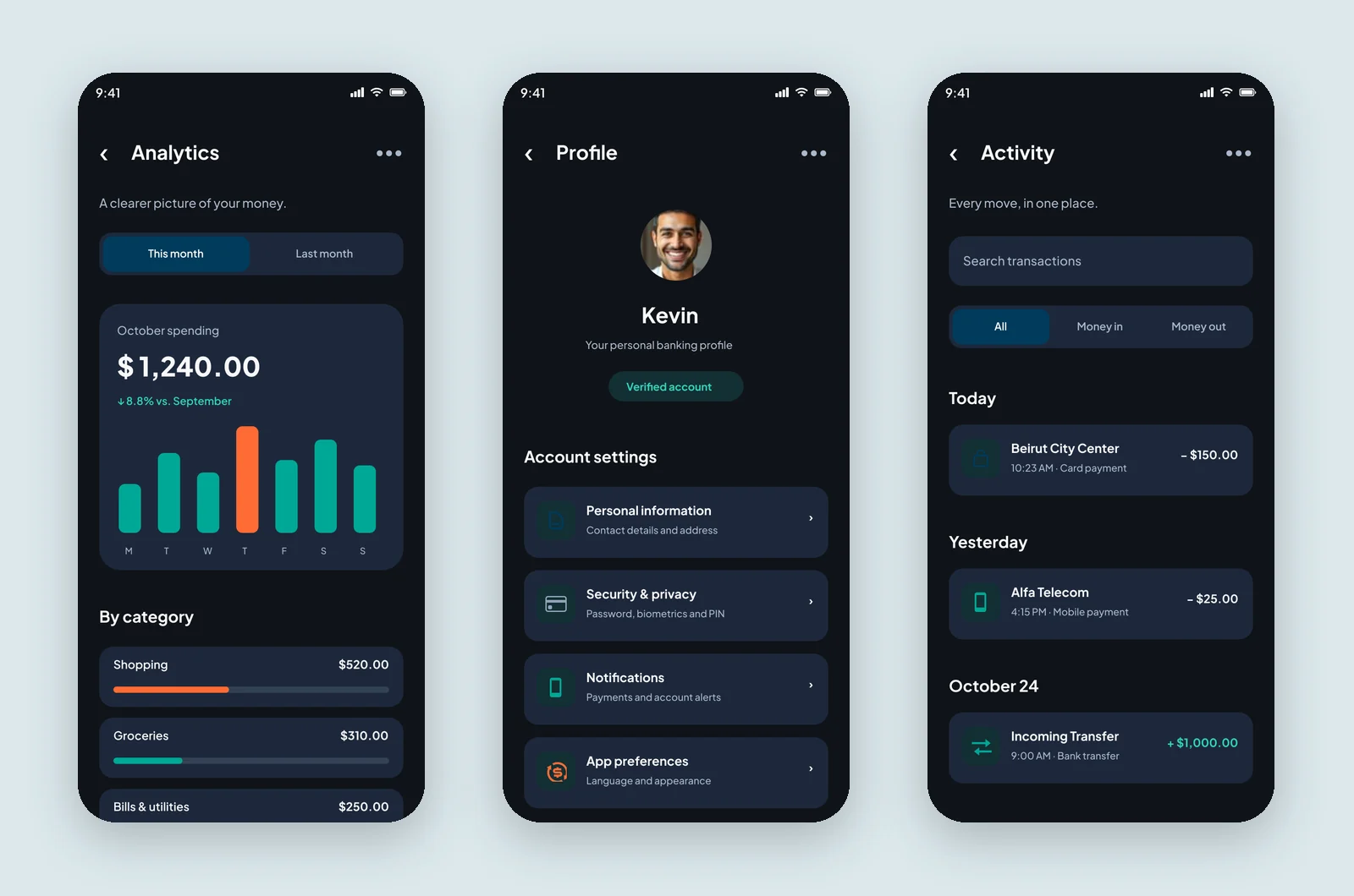
Mizan's visual language aims for calm and trust: deep navy and teal, soft rounded cards and Plus Jakarta Sans for friendly, legible numbers. A single orange is kept for the scan button so it is always easy to find.
Numbers first
Balances and amounts are the largest text on every screen, set in a bold, tabular style.
Same role, both themes
The primary button is navy in light and teal in dark: different colour, same contrast and meaning.
Calm by default
One accent per screen, soft surfaces and short, human subtitles like "Send money, stay connected."
10Usability testing & iterations
Task success, first round vs. after changes
Illustrative resultsModerated sessions on a clickable Figma prototype, five tasks each. Numbers below show how a test round would be reported.
Send $250 to a new recipient
Before60%After95%Exchange $100 to LBP and say what rate you got
Before50%After90%Pay the internet bill that's due next
Before70%After95%
What we saw
People weren't sure which currency the transfer amount was in.
What changed
Labelled the field 'Amount in USD', added a USD tag inside it, and showed the available balance under 'From account'.
Why
The currency should never be guessed, especially when two are in play.
What we saw
The exchange rate felt like a surprise on the confirmation screen.
What changed
Added an indicative rate box before review, plus fee and estimated arrival.
Why
Showing the rate early turns a moment of doubt into a decision.
What we saw
In dark mode the navy primary button blended into the background.
What changed
Switched the dark-theme primary button to teal, keeping navy for light.
Why
A primary action must keep its contrast in both themes.
11Final outcomes
Mizan turns dual-currency banking into a calm routine: both balances on one card, every money task one tap from home, and a clear review before anything leaves the account.
1 tap
from Home to transfer, exchange, bills or top-up
2 currencies
visible together on the balance card
9 × 2
screens designed in matching light and dark themes
Key takeaways
- In a dual-currency economy, the rate is part of the interface, not a detail.
- A review step slows people down by seconds and saves them from mistakes.
- Designing both themes together from one token set prevented contrast problems later.
What I would do next
- Run real moderated tests with both personas and replace the illustrative results.
- Add recurring bills and scheduled top-ups for families.
- Explore Arabic (right-to-left) layouts for every screen.