Hayy UX case study
A neighbourhood ordering app for Beirut, from research to final design: problem, personas, journey map, user flows, information architecture, wireframes, UI and usability testing.
- Role
- UX/UI designer
- Year
- 2025
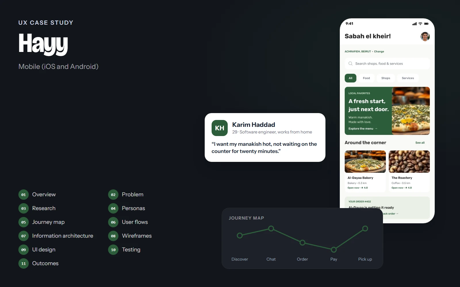
The screens, flows and structure on this page come from the real Hayy design. Research findings, personas' quotes, test results and numbers are illustrative examples of how I run each step; they are marked Illustrative and are not data from a real study.
01Project overview
Background
In Beirut neighbourhoods like Achrafieh, people already order from the bakery, the roastery or the flower shop by sending a WhatsApp message or calling. It works because it's personal, but it's messy: orders get lost in chats, prices aren't clear, and nobody knows when the manakish are actually ready. Hayy keeps the personal, conversational side and adds the structure of a real ordering app.
Objectives
- Let people order from local businesses inside a conversation, the way they already do.
- Turn a chat message into a clear order with items, prices and a total.
- Show pickup status so people arrive when the food is ready, not before.
- Help small businesses get discovered by neighbours within walking distance.
Challenges
- Mixing messaging and commerce without the app feeling like a shop with a chat bolted on.
- Prices in Lebanese pounds are long numbers that must stay readable.
- Small businesses have little time; the order flow must be fast on their side too.
Project at a glance
- Role
- UX/UI designer
- Platform
- Mobile app
- Screens
- 12, in light and dark
- Deliverables
- Research, flows, wireframes, UI kit
- Tool
- Figma
02Problem statement
Problem statement
Neighbours want to order fresh food and services from the small businesses around them, but today that happens in scattered chats and calls where orders, prices and pickup times are easy to lose.
Delivery platforms solve ordering, but they feel anonymous and favour big chains. Hayy's opportunity is to keep the relationship with the baker or the florist, while making each order clear, trackable and paid.
How might we…
- …turn a friendly chat into a clear, paid order?
- …let people know exactly when their order is ready for pickup?
- …help neighbours discover the businesses around the corner?
03UX research
Target audience
Residents of dense Beirut neighbourhoods (20–55) who buy daily from local bakeries, cafés and shops, and the small business owners who serve them.
Contextual observation
Watching how orders happen today at a neighbourhood bakery: calls, WhatsApp messages and walk-ins at peak times.
Interviews
Planned conversations with residents and shop owners about how they order, pay and pick up.
Chat-log review
Reviewing (anonymised) order chats to see what information is missing or repeated.
Key insights
Illustrative findingsINSIGHT 01
Chat is the relationship
People like greeting the baker and asking what's fresh. Replacing that with a form would lose the reason they buy local.
“I order from Abu Elie because he knows what I like.”
INSIGHT 02
The total is always unclear
In chats, prices are scattered across messages, so the final amount is a surprise at the counter.
INSIGHT 03
Timing is the real pain
People either wait at the shop or arrive when the bread is cold. A simple 'ready' signal matters most.
“I just want to know when to leave the house.”
INSIGHT 04
Discovery is word of mouth
New neighbours don't know which shops exist two streets away, or when they are open.
04User personas
Karim Haddad
Primary29 · Software engineer, works from home · Achrafieh, Beirut
“I want my manakish hot, not waiting on the counter for twenty minutes.”
Karim orders breakfast from the bakery downstairs most mornings and coffee beans from the roastery every week. He likes the personal touch but hates waiting.
Goals
- Order breakfast in a few taps
- Know exactly when to pick up
- Pay by card without carrying cash
Frustrations
- Messages that get missed during the morning rush
- Not knowing the total until he arrives
- Shops' opening hours that change without notice
Habits
- Orders between 7 and 9 am
- Saves his favourite places
- Uses dark mode
Aline Saade
Business41 · Owner, Aline's Flower Shop · Achrafieh, Beirut
“My customers are my neighbours. I just need their orders to be clear.”
Aline runs a small flower shop with one assistant. She takes orders by phone and WhatsApp and writes them on paper, which leads to mistakes on busy days.
Goals
- Receive orders with items and notes in one place
- Share photos of what's fresh today
- Get paid before preparing big orders
Frustrations
- Orders spread across calls and chats
- No-shows on prepared orders
- No time to manage a complex system
Habits
- Posts photos of new flowers every morning
- Answers messages between customers
- Busiest on weekends and holidays
05User journey map
Karim: a weekday morning, ordering manakish from Al-Dayaa Bakery before a 9:30 meeting.
Doing
Opens Hayy and sees the local favourite and shops around the corner.
Thinking
“What's fresh this morning?”
Pain point
Not knowing which places are open right now.
Opportunity
Home feed with 'Open now', distance and a local favourite.
Select a stage, or a face on the curve, to see what the person is doing, thinking and feeling.
06User flows
The main paths through the product, from the first tap to the goal. Decisions show where the path can branch.
Goal: Go from a shop's message to a paid pickup order.
- Notification from shop
- Chat with the bakery
- Tap 'Add to order'
- Order request card
- Items correct?No: message the shop to change
- Checkout
- Confirm & pay
- Order tracking
07Information architecture
Home
- Greeting and area
- Search
- Local favourite
- Around the corner
- Current order
Explore
- Food / Shops / Services
- Nearby businesses
- Shop page
- Menu and product details
Messages
- Stories from shops
- Chats with shops
- Neighbourhood groups
- Order request cards
Orders
- Checkout
- Order tracking
- Order history
- Order again
Profile
- Saved places
- Payment methods
- Settings
- Help & support
- Own a business?
The bottom bar is Home, Explore, Messages and Profile. Orders are reachable from Home (current order), from chats and from Profile, because people start an order from wherever they are.
08Wireframes
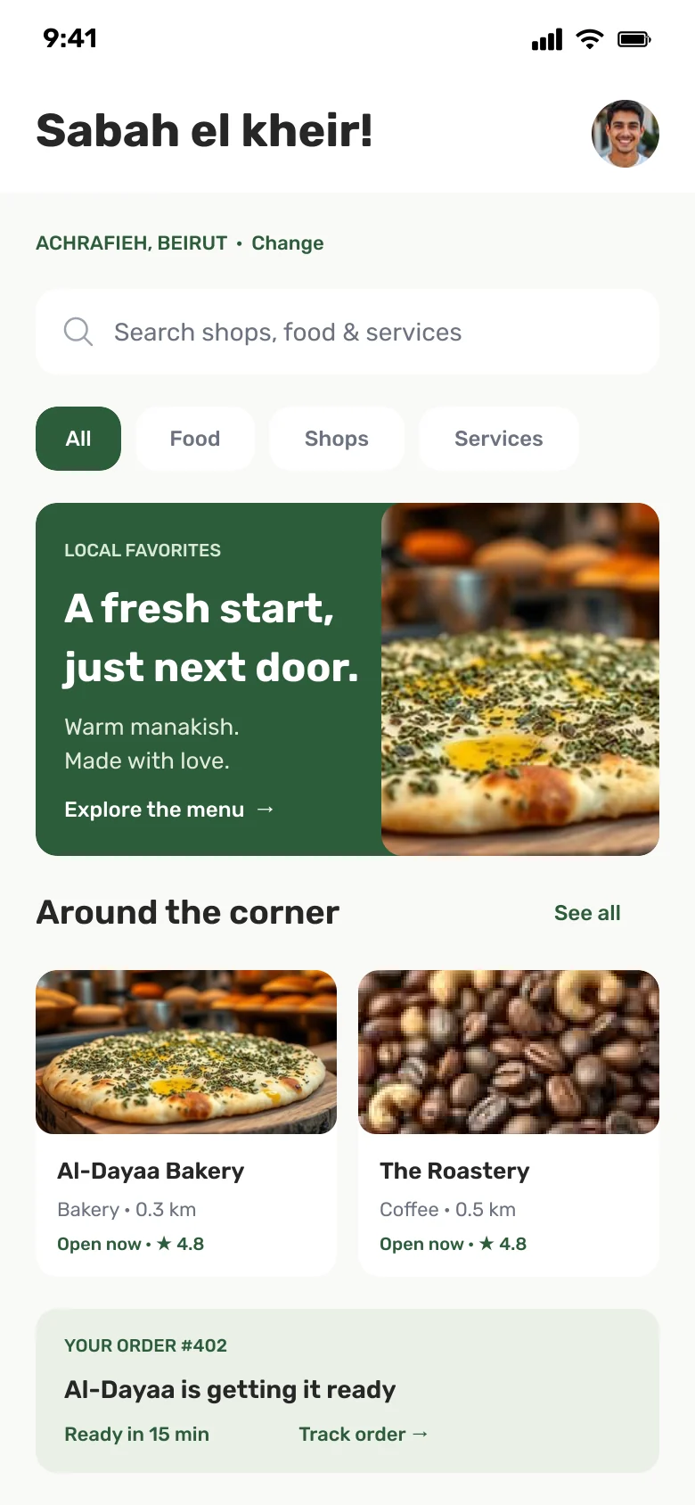
Low-fidelity layouts came first, to agree on structure and priorities before any colour or type.
Annotations
- 1One local favourite with a photo and a single action, instead of a carousel of ads.
- 2Nearby shops with distance, rating and 'Open now'.
- 3The current order stays on Home until it's picked up.
Drag across the screen to go from the low-fidelity sketch to the final design.
09UI design
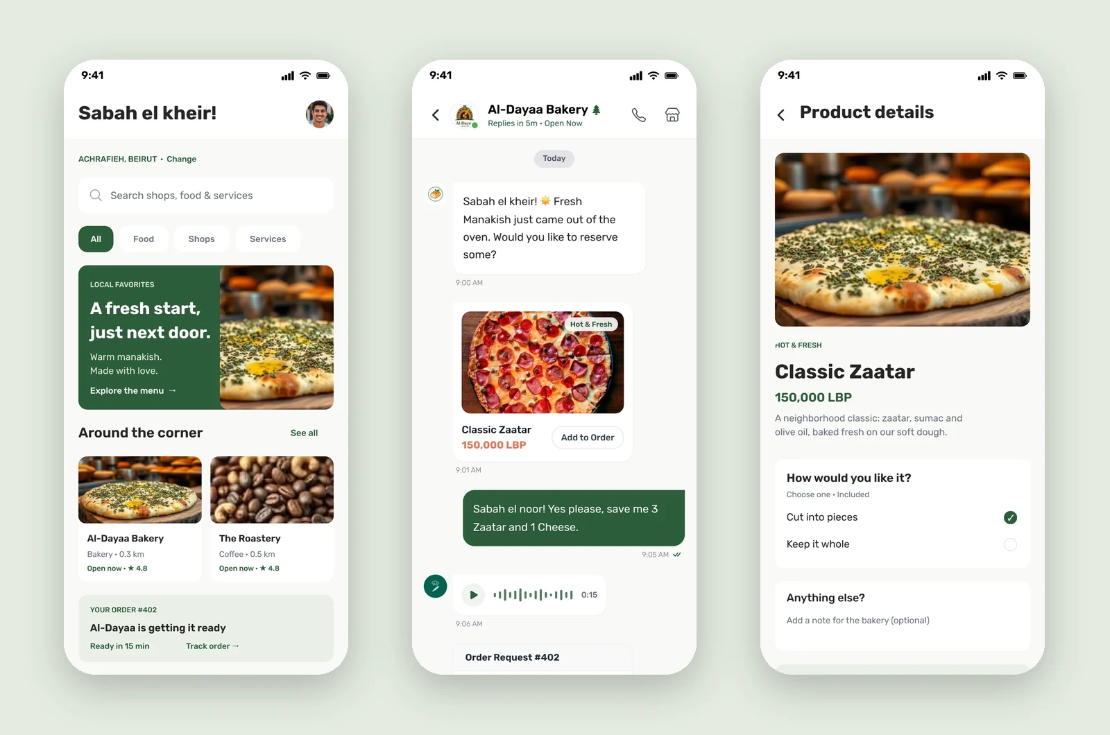
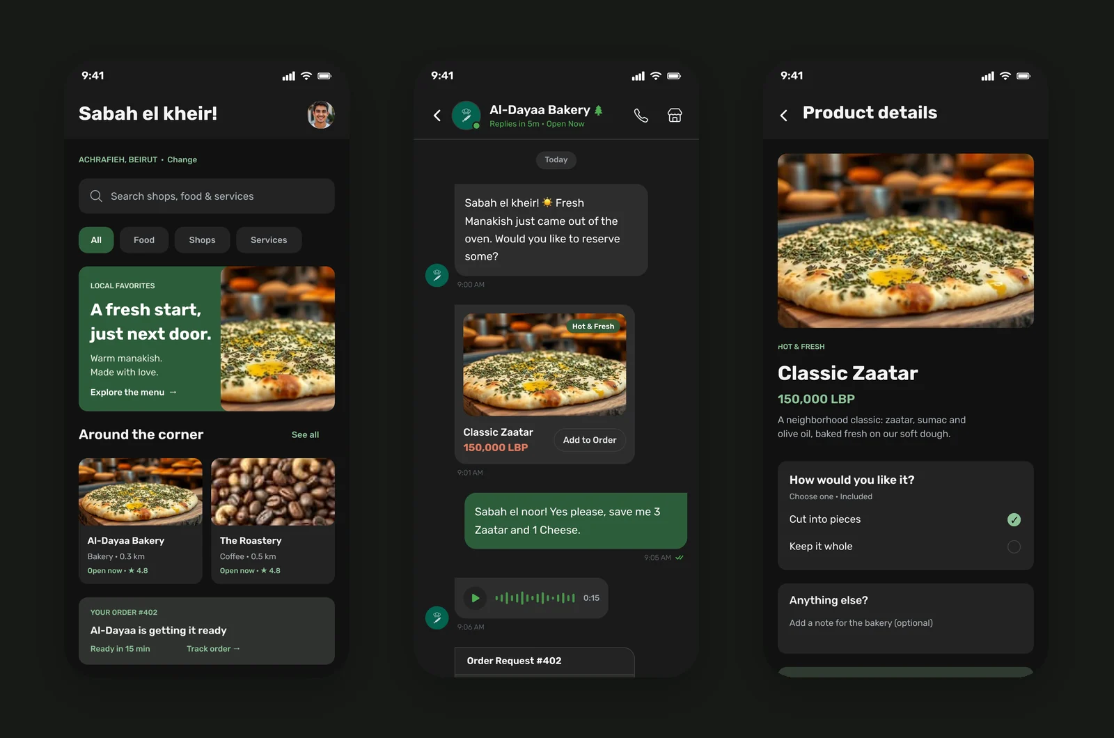
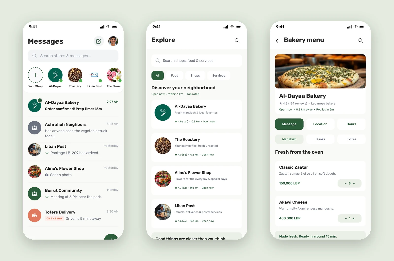
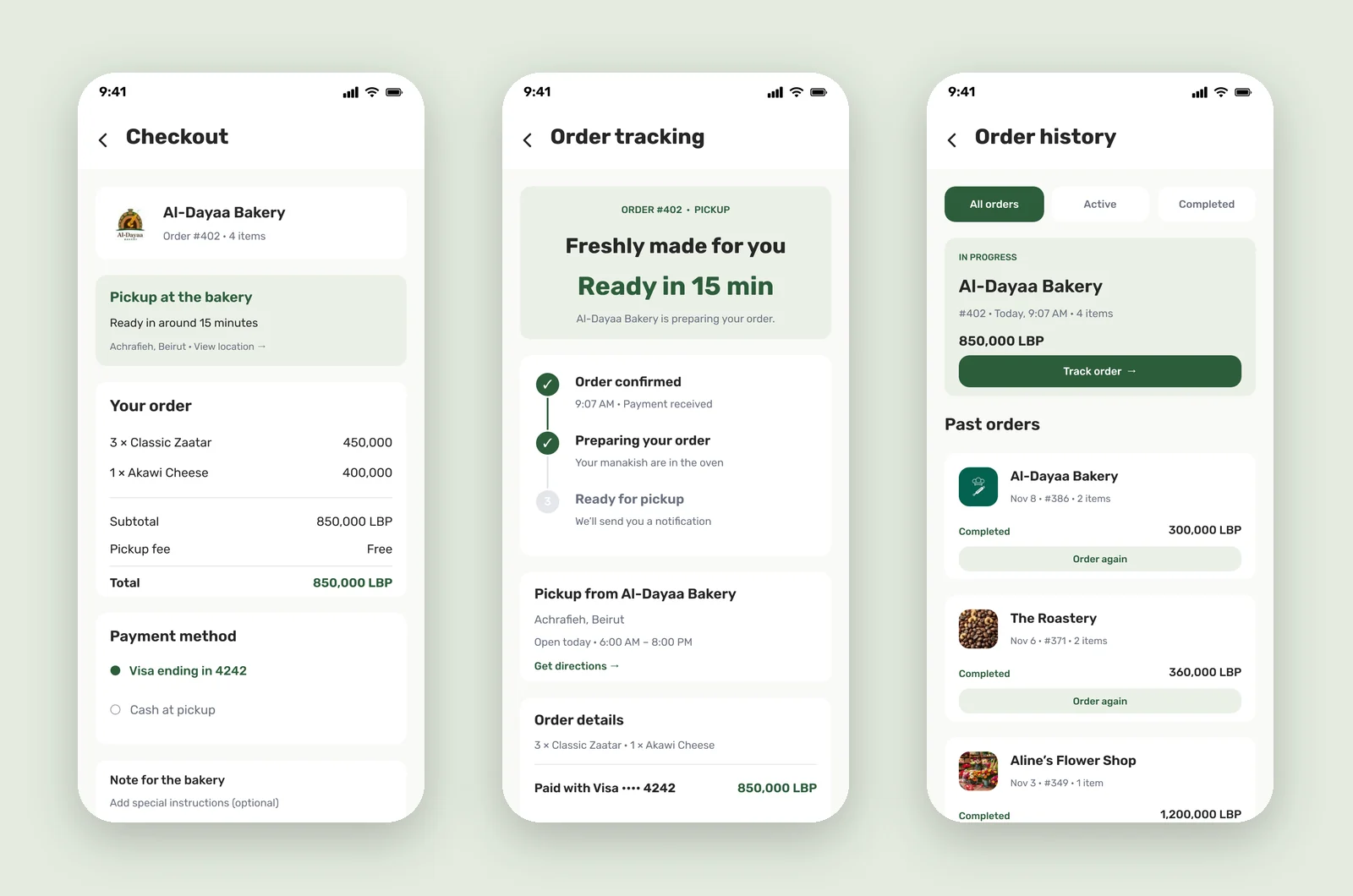
Hayy feels local and warm: cedar green for actions and sent messages, terracotta only for paying, and linen backgrounds instead of pure white. Food photography carries the emotion, and copy speaks in the neighbourhood's own voice.
Conversation first
Bubbles, voice notes and order cards share the same radius and spacing, so ordering feels like part of the chat.
One colour for money
Every action is green except 'Confirm & pay', which is terracotta.
Local voice
Arabic greetings, neighbourhood names and real shop types make the app feel like it belongs to the street.
10Usability testing & iterations
Task success, first round vs. after changes
Illustrative resultsModerated sessions on a Figma prototype with residents and one shop owner. Numbers below show how a test round would be reported.
Order 3 manakish from the bakery's chat
Before55%After92%Find out when your order is ready
Before60%After96%Order again from a past order
Before70%After94%
What we saw
People tapped 'Confirm & pay' expecting another review screen.
What changed
Moved the full summary above the button and gave paying a distinct terracotta colour.
Why
Spending money should never look like a routine action.
What we saw
Long LBP prices were hard to compare in the order card.
What changed
Right-aligned amounts with thousands separators and a bold total in green.
Why
Aligned numbers can be scanned and added at a glance.
What we saw
People didn't know whether to go to the shop yet.
What changed
Added a three-step tracker ending in 'Ready for pickup', and kept the status on Home.
Why
The main pain was timing, so status had to be visible everywhere.
11Final outcomes
Hayy keeps the personal side of buying local and adds what chats are missing: clear items and totals, simple payment, and a pickup time people can trust.
1 chat
from first message to a paid order
3 steps
in the order tracker, from confirmed to ready
12 × 2
screens in light and dark themes
Key takeaways
- Commerce inside a conversation works when the order becomes a clear, editable object.
- Giving 'pay' its own colour is a small change with a big effect on confidence.
- Local language and real places do more for trust than any visual style.
What I would do next
- Design the shop owner's side: receiving, accepting and preparing orders.
- Test with real neighbours and shops in Achrafieh.
- Add Arabic (right-to-left) and pickup reminders.