Rally
Rally is a fitness community app that brings trainers, workout partners, group events and monthly challenges together, in a bold dark and volt-yellow style.
- Role
- UX/UI designer
- Year
- 2025
The project
Rally is named after what it does: it rallies people to train together. Most fitness apps track you alone; Rally is built around the people who keep you going: your trainer, your crew and the community at the park. It brings chat, events, partner matching, challenges, nutrition and progress into one place, so staying motivated becomes a social habit.
Identity: bold, energetic and dark-only. Near-black surfaces with a single volt yellow (#D4FF00) that marks the next action, big confident numbers, and copy that cheers you on ("Showing up is a win").
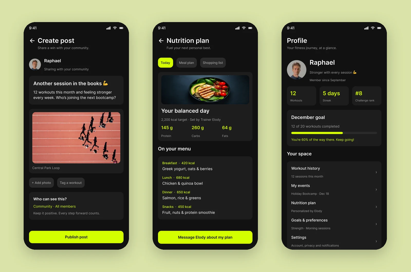
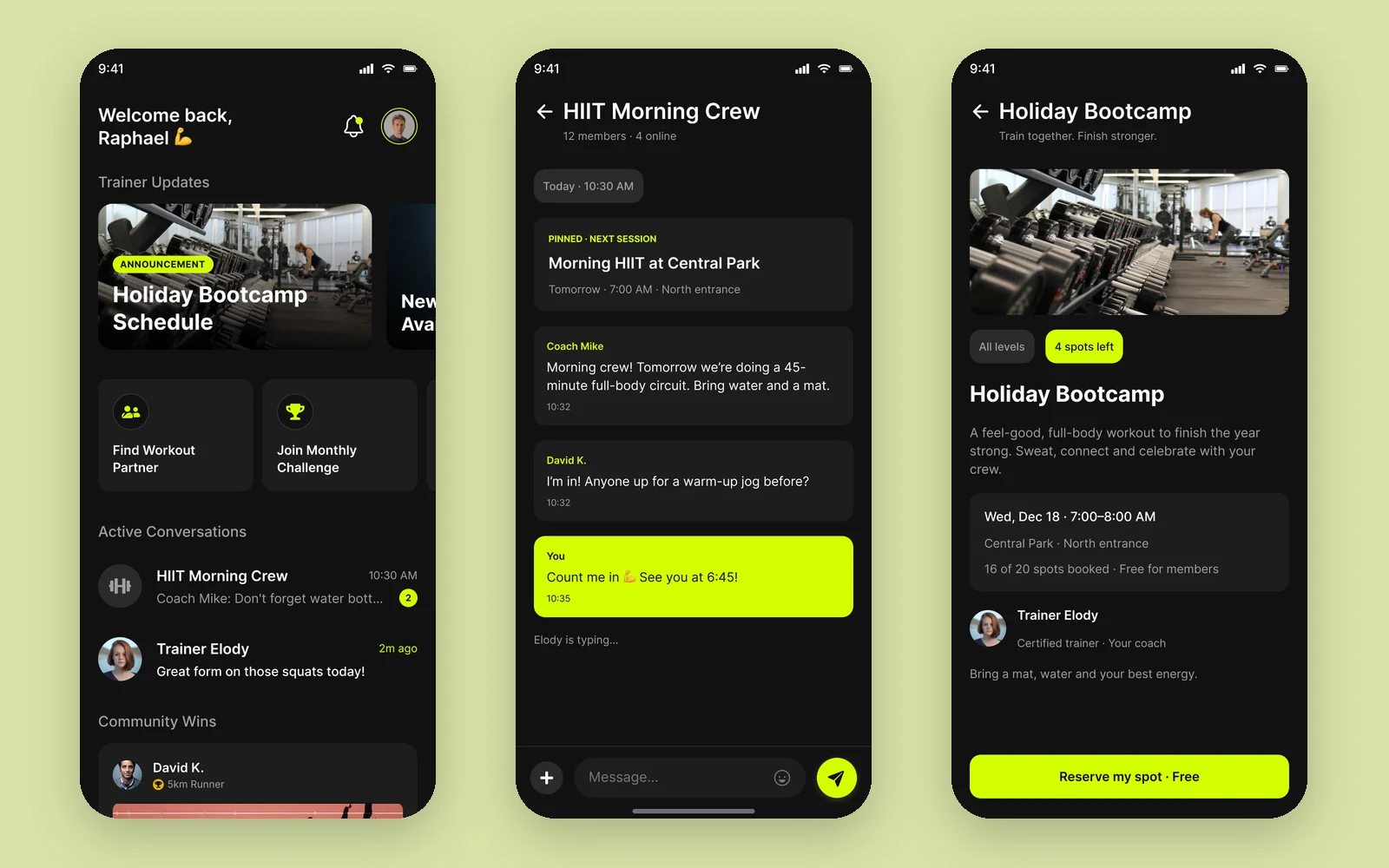
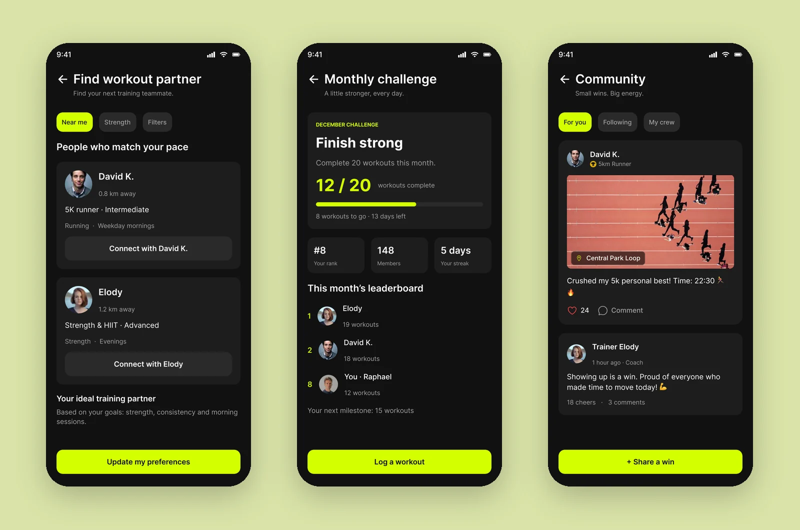
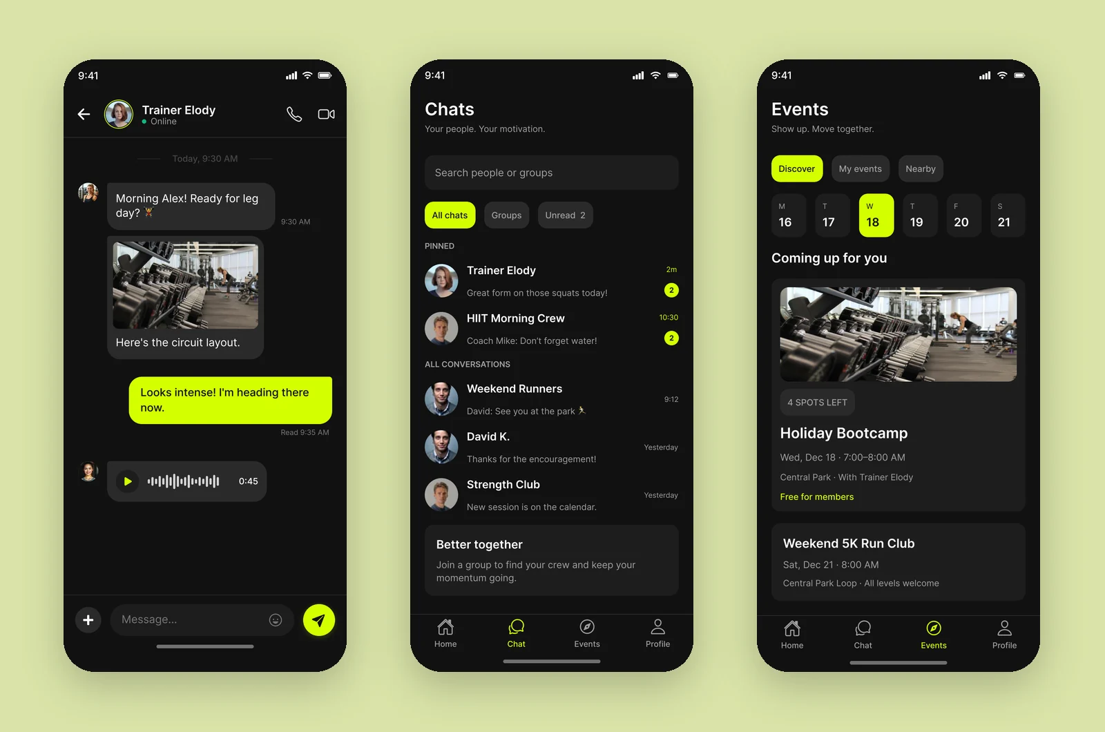
I designed fourteen screens: Home, Chat, Chats list, Group chat, Events, Event details, Find a workout partner, Monthly challenge, Community, Create post, Nutrition plan, Profile, Settings and Notifications.
Key features
- Home. Trainer updates, shortcuts to find a partner or join the monthly challenge, active conversations and community wins.
- Chat with trainers and crews. One-to-one and group chats with photos, voice notes and a pinned "next session" card.
- Events. A week calendar, upcoming sessions with spots left, and one-tap "Reserve my spot".
- Workout partners. People nearby who match your pace, sport and schedule.
- Challenges and community. Monthly goals with progress and a leaderboard, and a feed to share and cheer wins.
- Nutrition and profile. A daily plan from your trainer with macros and meals, and your workouts, streak and rank.
Visual style
The app is dark-only on purpose: near-black surfaces make the volt yellow (#D4FF00) feel like energy, and it is used for exactly the things that should get your attention: your messages, the main action on each screen, active tabs and progress. Everything else stays in grays, so a screen never has more than one or two highlights. Inter keeps the large numbers (12 / 20, 5 days, #8) bold and easy to read at a glance, even mid-workout.
Colour palette
Brand
Volt
#D4FF00
Primary buttons, active tabs, your messages, progress
Cheer red
#EF4444
Likes
Medal gold
#EAB308
Badges and achievements
Go green
#10B981
Online status
Surfaces and text
Black
#121212
App background
Carbon
#1E1E1E
Cards and inputs
Graphite
#2A2A2A
Chips and secondary buttons
Line
#333333
Dividers
White
#FFFFFF
Primary text
Silver
#A0A0A0
Secondary text
The full UI kit for this project is in the Rally design system.
More screens