Hayy
Hayy is a neighbourhood app for Beirut where people message the bakery, café or shop around the corner, order fresh food for pickup and follow it until it's ready.
- Role
- UX/UI designer
- Year
- 2025
The project
Hayy (حيّ) means neighbourhood in Arabic, and that's the whole concept. Instead of a big delivery catalogue, Hayy brings the feeling of the neighbourhood bakery onto the phone. It connects people in Achrafieh, Beirut with the places around the corner: a bakery, a roastery, a flower shop, the post office. You chat with a business like you would over the counter, order from its menu, pay, and pick up when it's ready.
Identity: warm, local and conversational. Cedar green and linen tones, terracotta for paying, appetising food photography, and copy in the neighbourhood's own voice ("Sabah el kheir", "Sabah el noor").
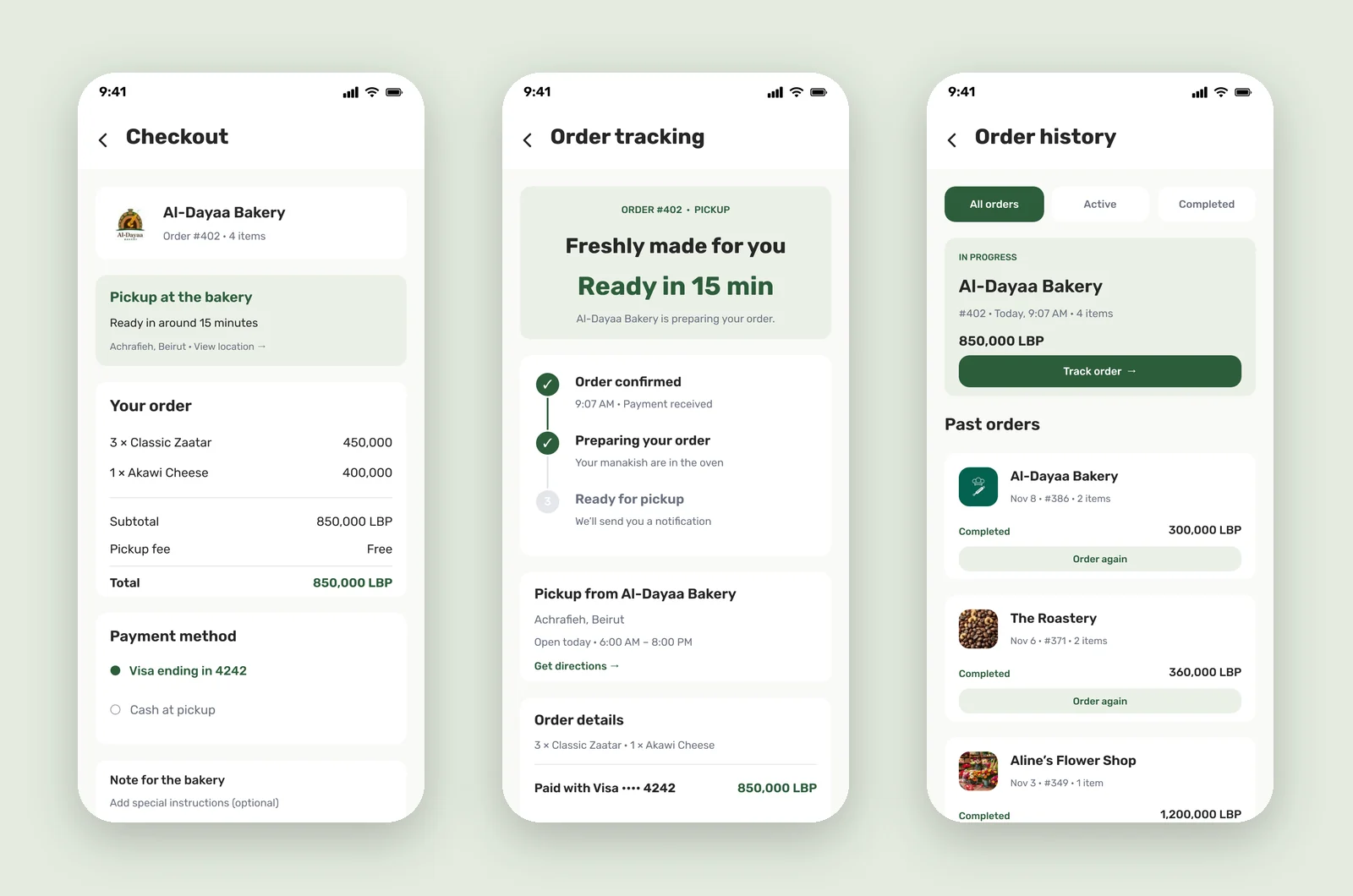
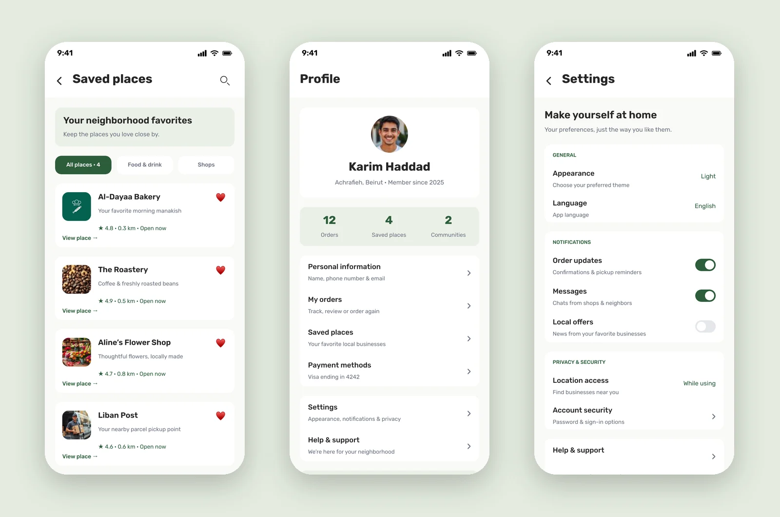
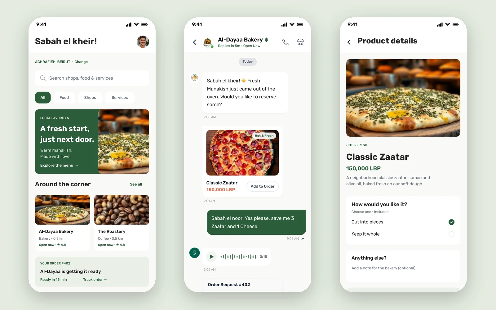
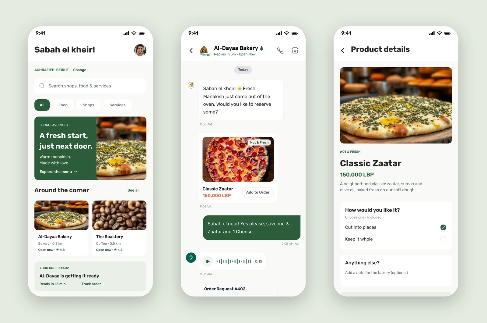
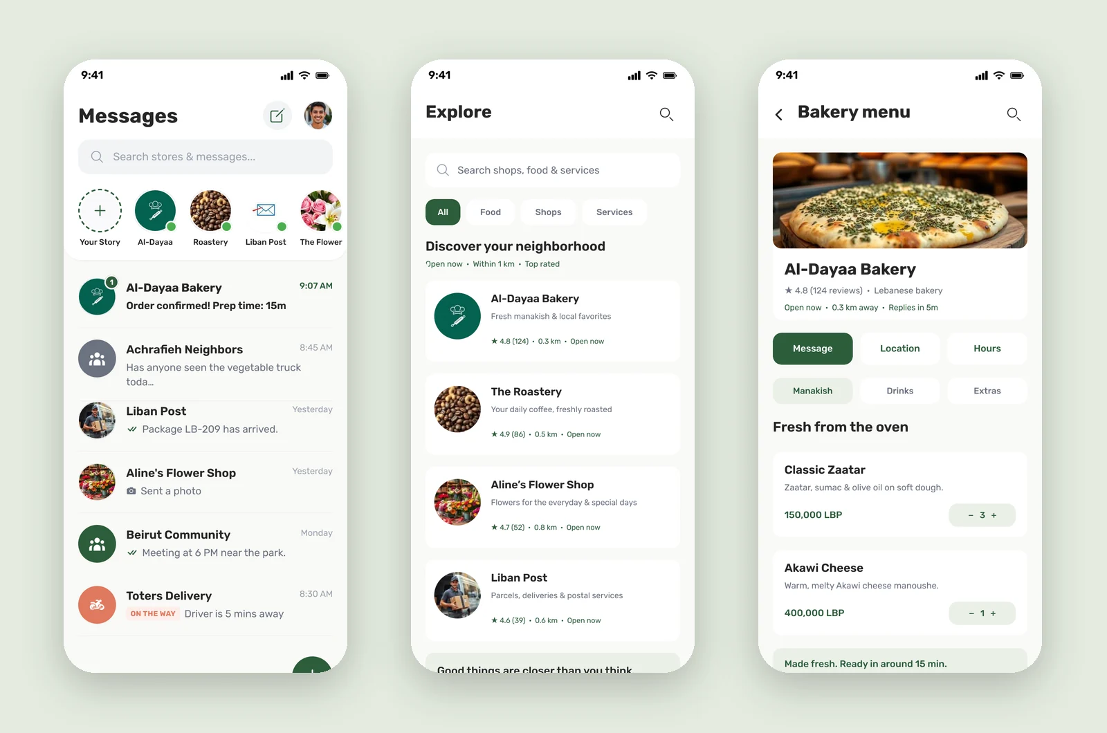
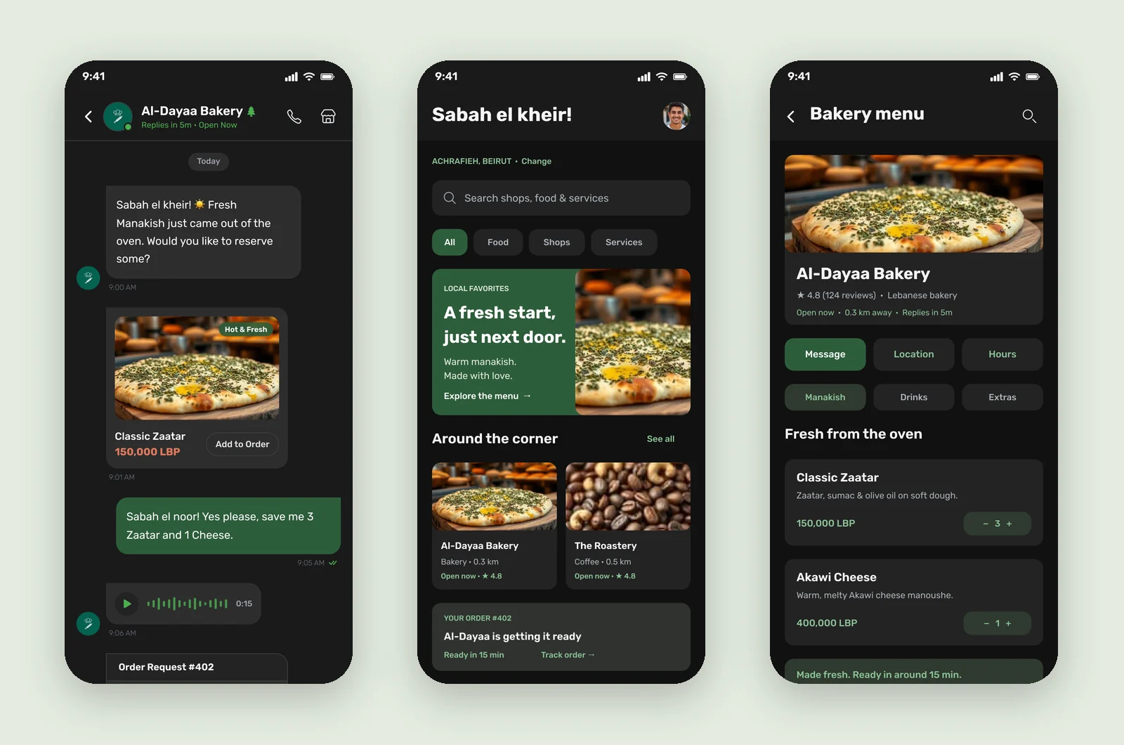
I designed twelve screens, all but the inbox in both a light and a dark theme: Messages, Chat, Home, Explore, Bakery menu, Product details, Checkout, Order tracking, Order history, Saved places, Profile and Settings.
Key features
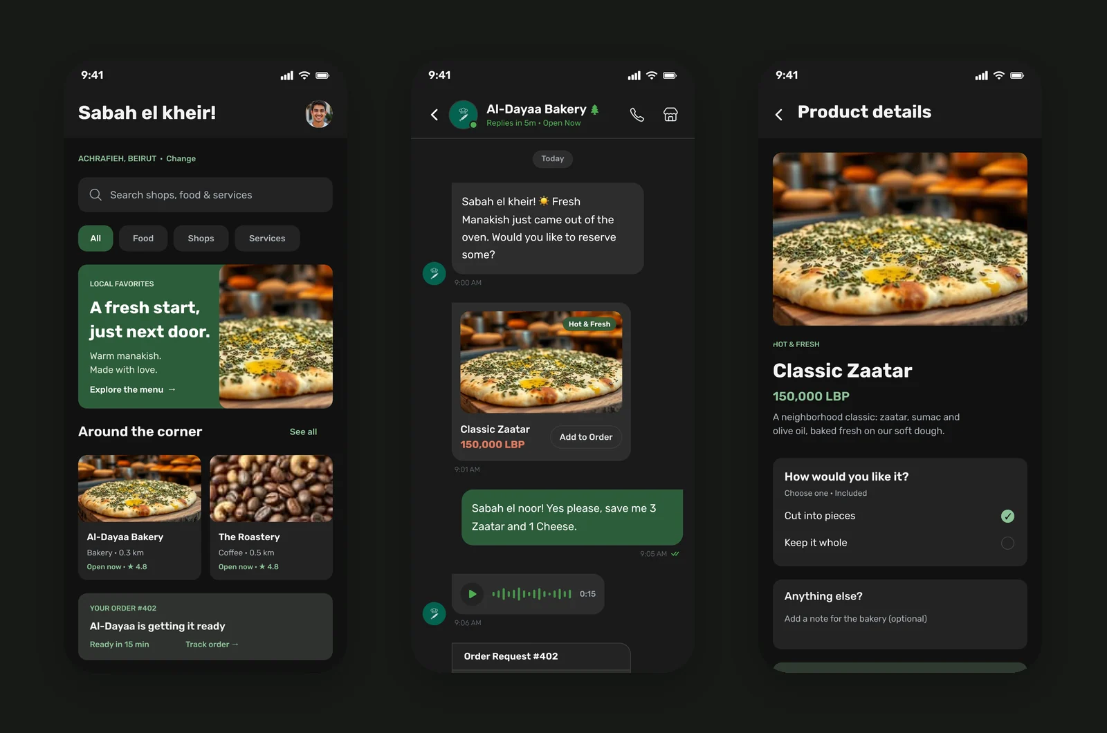
- Chat-first ordering. Shops post fresh items right in the conversation, with an "Add to order" button on the photo, and the order request appears as a card you can confirm and pay.
- Local home feed. A "Sabah el kheir!" greeting, your area, a local favourite, shops around the corner, and your current order's status.
- Explore. Nearby businesses with rating, distance and opening status, filtered by food, shops and services.
- Menu and product pages. Fresh-from-the-oven items with quantity steppers, options ("Cut into pieces") and notes for the bakery.
- Pickup checkout and tracking. Pickup time, order summary, card or cash at pickup, then a three-step tracker from "Order confirmed" to "Ready for pickup".
- Saved places and history. Favourite shops and one-tap "Order again".
Visual style
The app feels local and warm: a cedar green for actions and sent messages, a terracotta for paying, and a linen-white background instead of pure white. Big, appetising food photos carry the emotion, and Inter in heavy weights gives the headings a friendly, confident voice. Copy uses the neighbourhood's own language ("Sabah el kheir", "Sabah el noor") so the app sounds like the people in it.
Colour palette
Brand
Cedar green
#2D5D3B
Primary buttons, active chips, sent messages
Sage
#8DC397
Prices and links in dark
Mint
#ECF1E9
Order status and tips in light
Moss
#303A30
Order status and tips in dark
Terracotta
#C56349
Confirm & pay, prices in chat
Heart red
#E5484D
Saved places
Surfaces and text
Linen
#FAF9F6
Background in light
White
#FFFFFF
Cards in light
Black
#121212
Background in dark
Graphite
#242424
Cards in dark
Ink
#1A1A1A
Text in light
Fog
#ADB3BC
Secondary text in dark
Gray
#6B7280
Secondary text in light
The full UI kit for this project is in the Hayy design system.
More screens