Rally UX case study
A fitness community app, from research to final design: problem, personas, journey map, user flows, information architecture, wireframes, UI and usability testing.
- Role
- UX/UI designer
- Year
- 2025
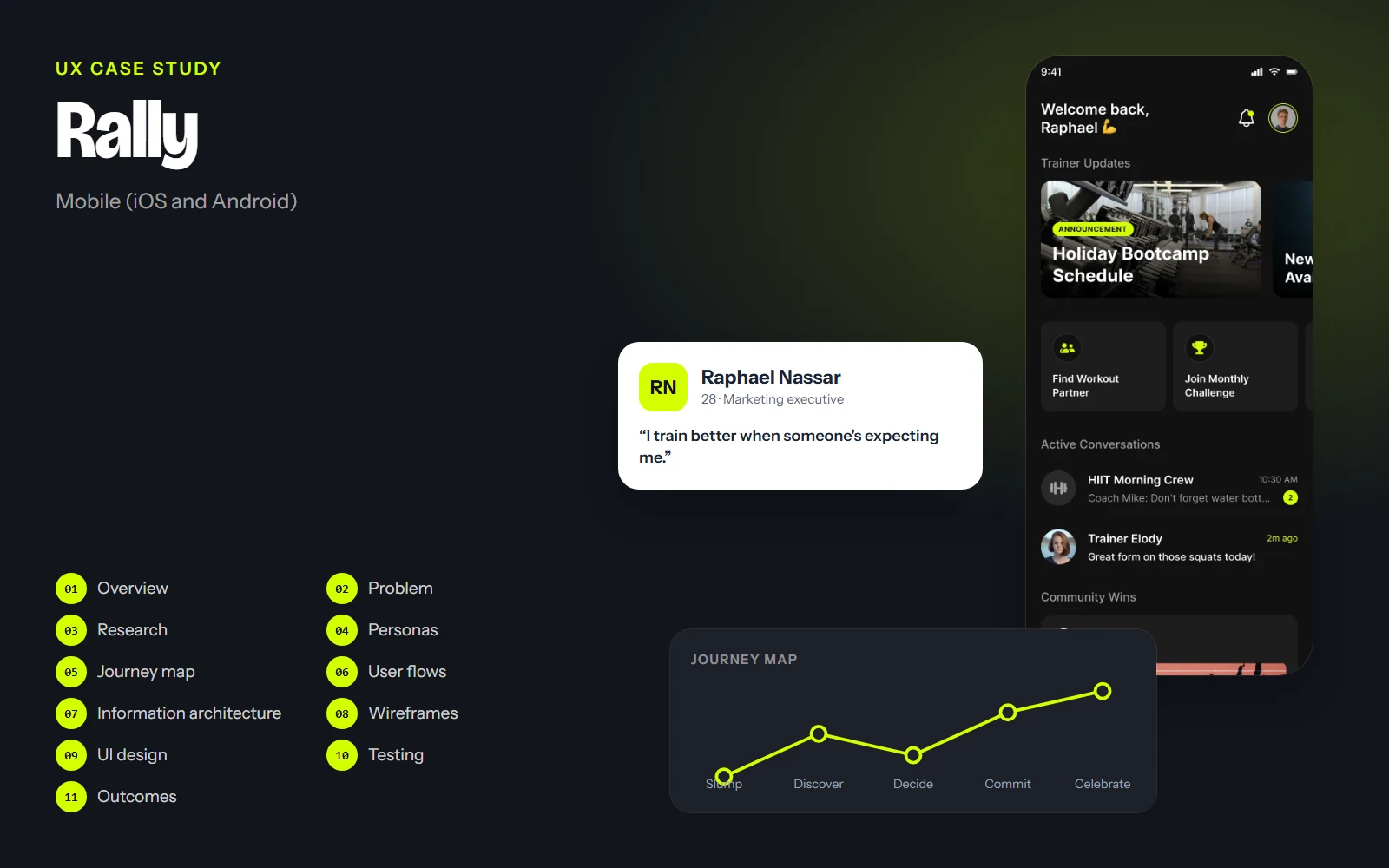
The screens, flows and structure on this page come from the real Rally design. Research findings, personas' quotes, test results and numbers are illustrative examples of how I run each step; they are marked Illustrative and are not data from a real study.
01Project overview
Background
Most people who quit training don't stop because of the workout; they stop because they're doing it alone. Fitness apps track steps and sets, but the things that actually keep people going (a trainer checking in, a crew waiting at the park, a friendly challenge) live in group chats and spreadsheets. Rally brings them into one place.
Objectives
- Make the community (trainer, crew, partners) the centre of the app, not an extra tab.
- Get people from 'what's on?' to 'I'm in' in a few taps.
- Keep motivation visible: streaks, challenges and wins from others.
- Design an energetic, dark interface that is readable outdoors and mid-workout.
Challenges
- Combining chat, events, challenges and nutrition without a cluttered app.
- Using a loud accent colour (volt) without making every screen shout.
- Making social features welcoming for beginners, not just for athletes.
Project at a glance
- Role
- UX/UI designer
- Platform
- Mobile app
- Screens
- 14, dark theme
- Deliverables
- Research, flows, wireframes, UI kit
- Tool
- Figma
02Problem statement
Problem statement
People who want to train regularly lose motivation when they train alone, and the tools that connect them with trainers and training partners are scattered across chats, calendars and spreadsheets.
Coaches manage groups in messaging apps, events are announced in screenshots, and progress lives in notes. Rally's goal is to make showing up easier by putting the people, the plan and the next session in one place.
How might we…
- …make it easy to find someone to train with?
- …turn an event announcement into a reserved spot in one tap?
- …keep people motivated between sessions?
03UX research
Target audience
Adults (20–40) who train two to five times a week in gyms, parks and running clubs, plus the coaches who run small group sessions.
Diary study
Participants note when and why they skip or attend a session over two weeks.
Coach interviews
How group trainers announce sessions, track attendance and check in on members.
App audit
Review of fitness trackers, run clubs and group-messaging habits to find the gaps between them.
Key insights
Illustrative findingsINSIGHT 01
People show up for people
Knowing someone is waiting is a stronger motivator than any badge.
“If my crew is there at 7, I'm there at 7.”
INSIGHT 02
Events die in group chats
Session details get buried under messages; people miss changes of time or place.
INSIGHT 03
Beginners feel intimidated
New members hesitate to join groups they think are 'too advanced'.
“I didn't want to be the slowest one.”
INSIGHT 04
Small wins keep momentum
Streaks and simple progress (12 of 20 workouts) motivate more than detailed stats.
04User personas
Raphael Nassar
Primary28 · Marketing executive · Beirut
“I train better when someone's expecting me.”
Raphael wants to train four times a week but busy weeks break his routine. He's motivated by his HIIT crew and a coach who checks in.
Goals
- Join sessions without digging through chats
- Find a partner who trains at the same time
- Keep his streak alive
Frustrations
- Missing session changes posted in group chats
- Training alone on busy weeks
- Apps full of stats he never reads
Habits
- Trains before work, around 7 am
- Shares wins with friends
- Checks the app between sets
Elody Mansour
Coach33 · Certified personal trainer · Beirut
“My job is to keep people coming back.”
Elody runs small group sessions in a park and a gym, and coaches individuals on training and nutrition. She juggles three group chats and a spreadsheet.
Goals
- Announce sessions and see who's coming
- Share nutrition plans with clients
- Celebrate members' progress
Frustrations
- No-shows she couldn't predict
- Repeating the same info in several chats
- No single view of a client's progress
Habits
- Posts the week's sessions on Sunday
- Sends voice notes to clients
- Checks in after missed sessions
05User journey map
Raphael: finding and joining a Saturday bootcamp after a week of skipped workouts.
Doing
Notices he skipped three sessions this week.
Thinking
“I'm losing my routine again.”
Pain point
Nothing pulls him back except willpower.
Opportunity
Home shows his crew's activity and a gentle streak reminder.
Select a stage, or a face on the curve, to see what the person is doing, thinking and feeling.
06User flows
The main paths through the product, from the first tap to the goal. Decisions show where the path can branch.
Goal: Go from a trainer update to a reserved spot.
- Home
- Trainer update
- Event details
- Spots left?No: join the waitlist
- Reserve my spot
- Added to My events
- Reminder before session
07Information architecture
Home
- Trainer updates
- Find partner
- Monthly challenge
- Active conversations
- Community wins
Chat
- Pinned (coach, crew)
- Groups
- Direct messages
- Voice notes and photos
Events
- Discover
- My events
- Nearby
- Event details
Community
- For you
- Following
- My crew
- Create post
Profile
- Stats and streak
- Workout history
- Nutrition plan
- Goals
- Settings
The bottom bar is Home, Chat, Events and Profile; a floating '+' creates posts. Community and challenges are entered from Home, where they do the most motivating work.
08Wireframes
Low-fidelity layouts came first, to agree on structure and priorities before any colour or type.
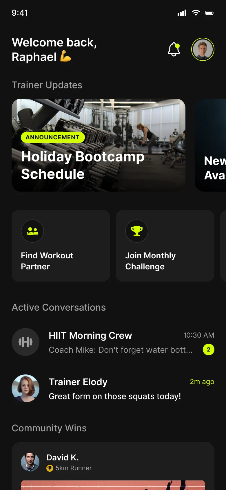
Annotations
- 1Trainer updates first: the coach's voice opens the app.
- 2Two shortcuts that fight a slump: find a partner, join the challenge.
- 3Conversations with unread counts keep the crew close.
- 4A community win shows that people like you are showing up.
Drag across the screen to go from the low-fidelity sketch to the final design.
09UI design
Rally is dark-only and high-energy. Near-black surfaces let a single volt yellow mark what matters: the main action, your own messages, active tabs and progress. Inter in bold weights keeps big numbers readable at a glance, even outdoors.
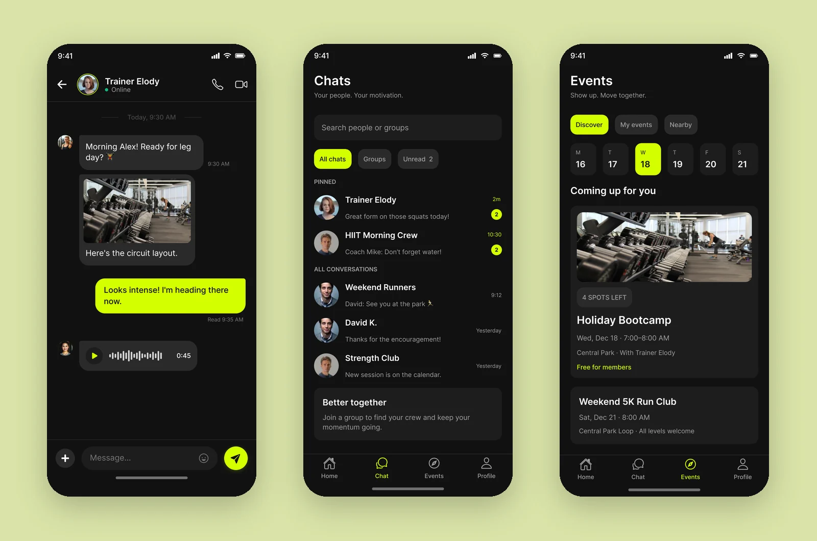
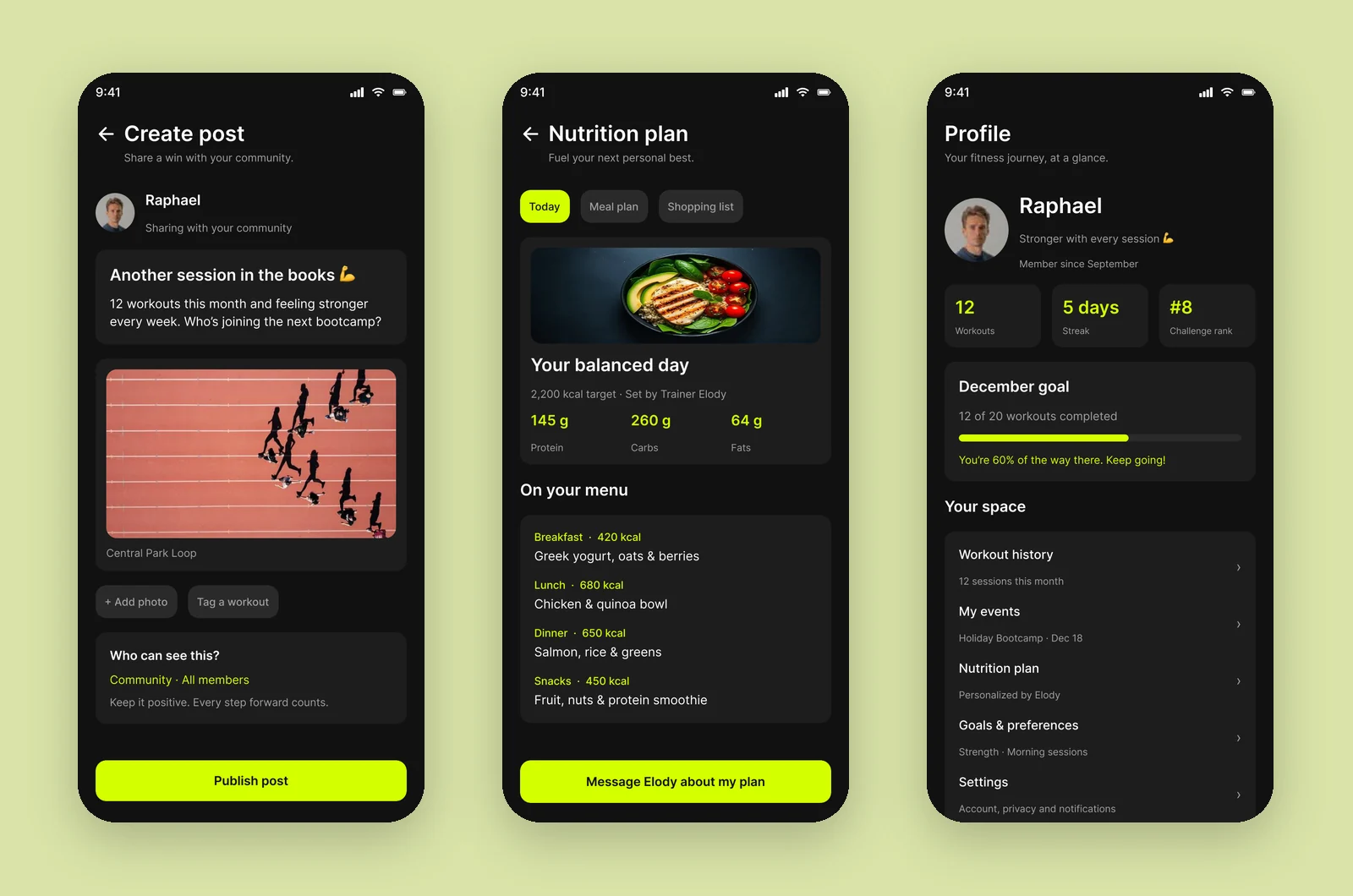
One volt per screen
The accent marks the next action, so each screen has one or two highlights at most.
Big numbers, few words
12 / 20, 5 days, #8: progress is shown, not explained.
People in every view
Avatars, names and cheers appear on nearly every screen, because people are the reason to come back.
10Usability testing & iterations
Task success, first round vs. after changes
Illustrative resultsUnmoderated tests on a Figma prototype with gym-goers and one coach. Numbers below show how a test round would be reported.
Reserve a spot at Saturday's bootcamp
Before70%After96%Find a partner who runs near you
Before55%After90%See how far you are in the monthly challenge
Before65%After95%
What we saw
Volt text on dark cards was hard to read at small sizes.
What changed
Used volt mainly as a fill with near-black text; kept volt text only for large numbers and short labels.
Why
Bright yellow reads best as a surface, not as thin text.
What we saw
Beginners skipped events they thought were too hard.
What changed
Added level chips ('All levels', '4 spots left') and the trainer's welcome on event pages.
Why
Clear expectations lower the fear of joining.
What we saw
The leaderboard felt discouraging for people far from the top.
What changed
Always show your own position and the next milestone ('Your next milestone: 15 workouts').
Why
Progress against yourself motivates more than rank.
11Final outcomes
Rally makes the people around you the reason to train: one place to talk to your coach and crew, reserve sessions in a tap, and see your progress grow.
1 tap
to reserve a spot from an event page
4 tabs
Home, Chat, Events and Profile, plus a create button
14
screens in one consistent dark theme
Key takeaways
- Social motivation is the product; tracking is a supporting feature.
- A loud accent colour works when it's rationed to one job per screen.
- Designing for beginners made the app better for everyone.
What I would do next
- Design the coach's tools: attendance, client progress and broadcast updates.
- Test outdoors, in bright light, with real sessions.
- Add an optional light theme for daytime use.