FoodFlow UX case study
A restaurant ordering and delivery platform, from research to final design: problem, personas, journey map, user flows, information architecture, wireframes, UI and usability testing.
- Role
- UX/UI designer
- Year
- 2025
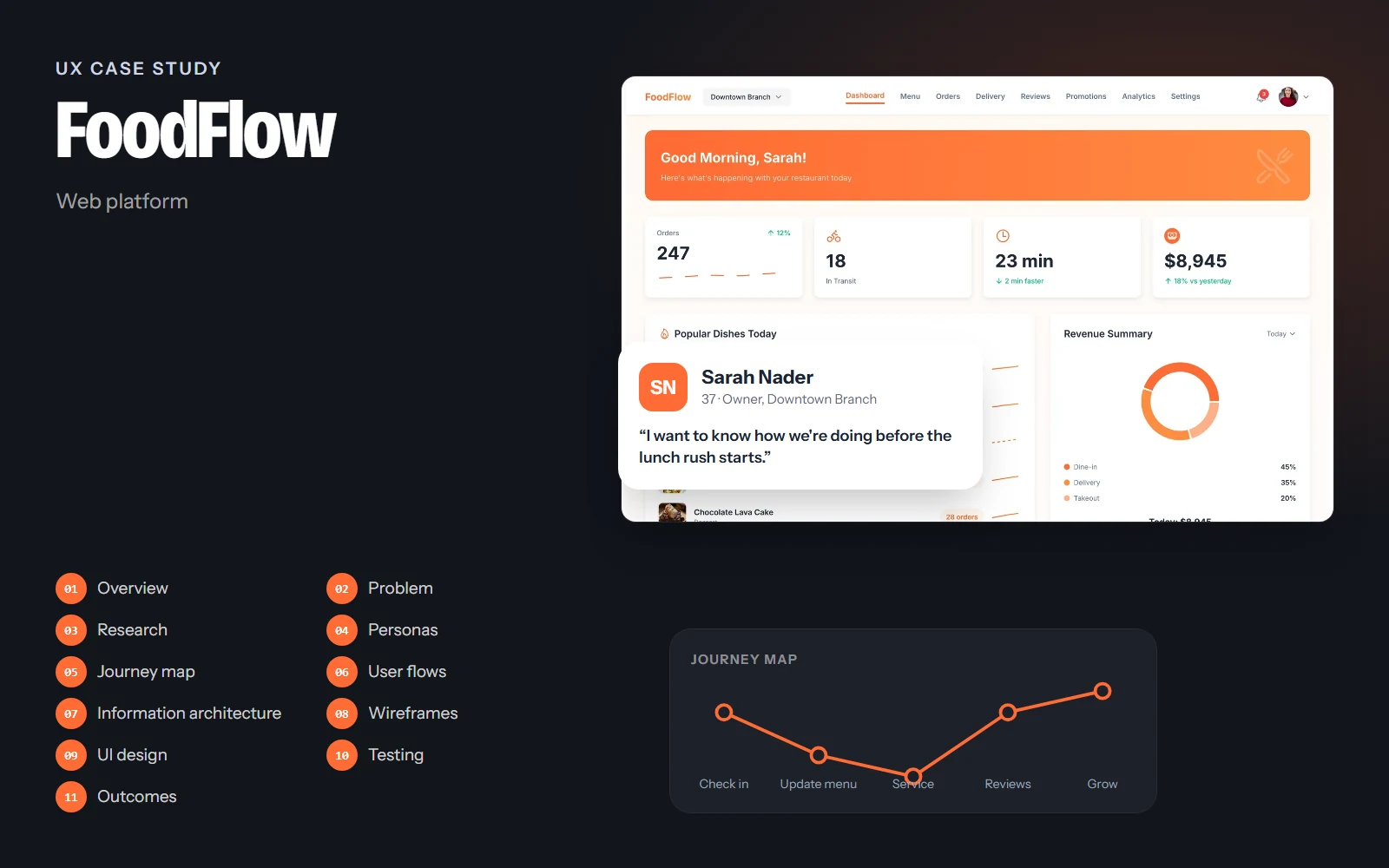
The screens, flows and structure on this page come from the real FoodFlow design. Research findings, personas' quotes, test results and numbers are illustrative examples of how I run each step; they are marked Illustrative and are not data from a real study.
01Project overview
Background
Restaurants that sell online juggle tablets from several delivery apps, a paper menu that's out of date, drivers on the phone and reviews they never have time to answer. FoodFlow is the back office of a restaurant's online store: one workspace for the menu, orders, delivery, reviews, promotions and analytics.
Objectives
- Give owners a morning snapshot: how are we doing today and what needs attention?
- Make menu changes (prices, availability) quick, even during service.
- Track every order from the kitchen to the doorstep in one place.
- Help restaurants grow with promotions and by answering reviews.
Challenges
- Used in a busy kitchen, often on a tablet, by people with little time.
- Lots of status information (orders, drivers) that changes every minute.
- Owners are food experts, not data experts.
Project at a glance
- Role
- UX/UI designer
- Platform
- Web platform
- Pages
- 8, in light and dark
- Deliverables
- Research, flows, wireframes, UI kit
- Tool
- Figma
02Problem statement
Problem statement
Restaurant owners selling online lose time and orders because menu, orders, drivers and customer feedback live in different tools that don't talk to each other.
A dish that's sold out but still on the menu, a late driver nobody noticed, a bad review left unanswered: each is small, but together they cost money and reputation. FoodFlow puts them on one screen.
How might we…
- …show what needs attention today in one glance?
- …let staff mark a dish unavailable in one tap during service?
- …make answering reviews a habit, not a chore?
03UX research
Target audience
Owners and managers of small and mid-size restaurants with dine-in, takeout and delivery, and the staff who handle orders during service.
Service observation
Watching a lunch rush: how orders come in, how staff react, what gets missed.
Owner interviews
What owners check first in the morning, and what they wish they could see.
Tool inventory
Listing every tablet, app and paper system used to run online sales today.
Key insights
Illustrative findingsINSIGHT 01
The morning check-in
Owners want four numbers each morning: orders, deliveries in transit, delivery time and revenue.
“Tell me how yesterday went and what's happening now.”
INSIGHT 02
Availability changes mid-service
Sold-out dishes stay online because updating the menu takes too many steps.
INSIGHT 03
Status is everything
During service, staff only care about the status of each order: preparing, out for delivery, done.
INSIGHT 04
Reviews feel like homework
Owners care about reviews but rarely reply because it's buried in another app.
04User personas
Sarah Nader
Primary37 · Owner, Downtown Branch · Beirut
“I want to know how we're doing before the lunch rush starts.”
Sarah runs a busy restaurant with dine-in, takeout and delivery. She starts every day with numbers and spends the rest of it solving problems.
Goals
- See today's performance at a glance
- Keep the online menu accurate
- Grow repeat customers with promotions
Frustrations
- Four tablets for four delivery apps
- Sold-out dishes still being ordered
- No time to answer reviews
Habits
- Checks the dashboard at 9 am
- Reviews analytics weekly
- Plans promotions for weekends
Joe Rizk
Secondary24 · Shift manager · Beirut
“During the rush I just need to see what's late.”
Joe runs the floor and the pass during service. He uses FoodFlow on a tablet next to the kitchen to track orders and drivers.
Goals
- Spot late orders immediately
- Mark dishes unavailable fast
- Assign drivers without phone calls
Frustrations
- Small text on tablets
- Too many clicks during service
Habits
- Keeps Orders open all shift
- Uses dark mode in the evening
05User journey map
Sarah: a weekday from the morning check-in to planning a weekend promotion.
Doing
Opens the dashboard with her morning coffee.
Thinking
“How did we do, and what's happening now?”
Pain point
Numbers spread across delivery apps.
Opportunity
Greeting banner and four KPIs for today.
Select a stage, or a face on the curve, to see what the person is doing, thinking and feeling.
06User flows
The main paths through the product, from the first tap to the goal. Decisions show where the path can branch.
Goal: Stop orders for a dish in under ten seconds.
- Top nav
- Menu
- Search or filter
- Dish found?No: change category chip
- Toggle availability
- Hidden from customers
07Information architecture
Dashboard
- Today's KPIs
- Popular dishes
- Revenue by channel
- Delivery performance
- Recent orders
Menu
- Dish cards
- Categories
- Availability
- Import menu
Orders
- Status tabs
- Order table
- Order details
Delivery
- Active deliveries
- Drivers
- Performance
Reviews
- Rating overview
- Needs reply
- Replies
Promotions
- Active
- Scheduled
- Expired
- Results
Analytics
- Revenue
- Sales by channel
- Top dishes
Settings
- Restaurant profile
- Business hours
- Order preferences
- Team
A flat top navigation with eight sections and a branch switcher. Owners jump between orders, menu and delivery all day, so nothing is more than one click away.
08Wireframes
Low-fidelity layouts came first, to agree on structure and priorities before any colour or type.
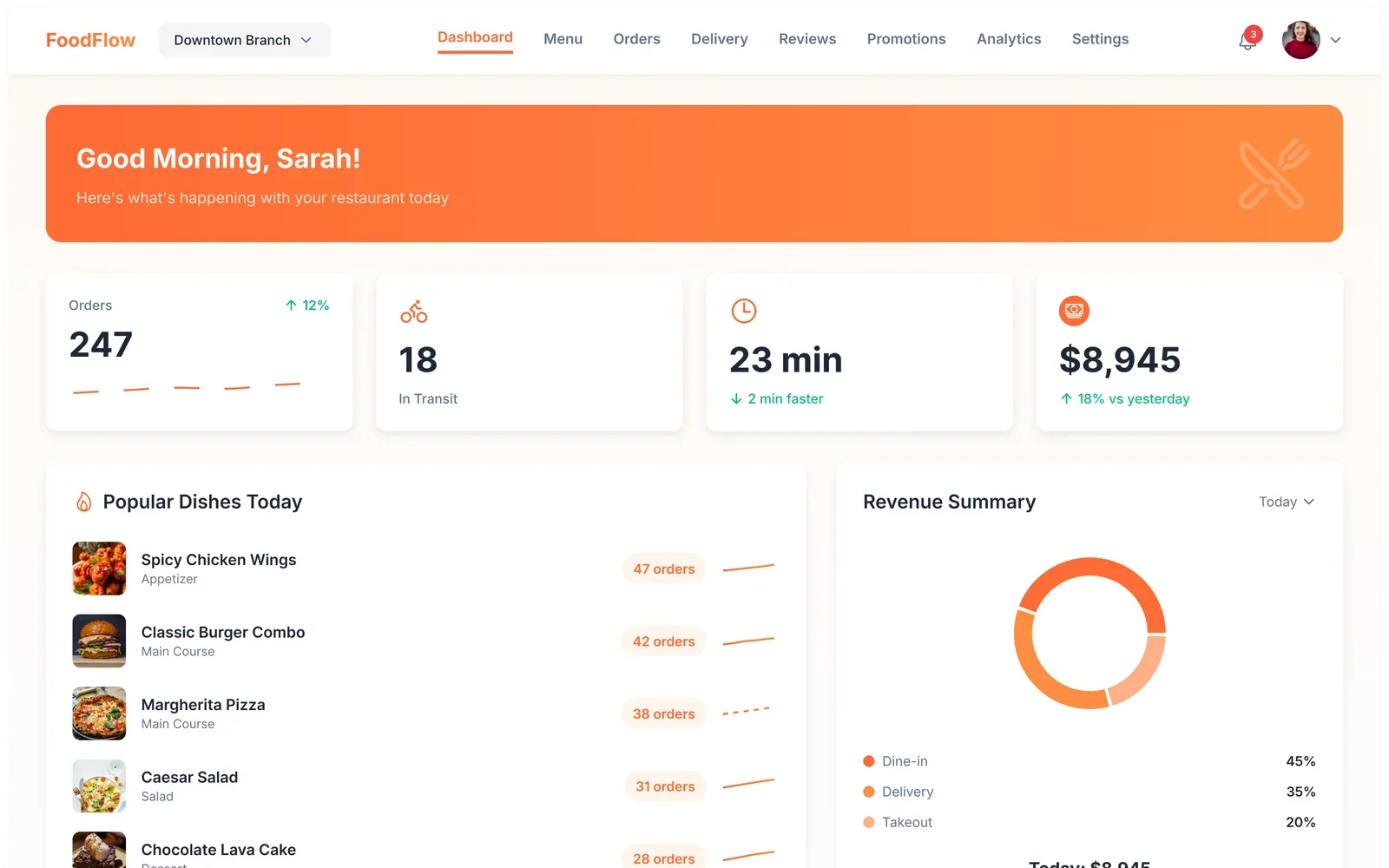
Annotations
- 1A friendly greeting sets the tone for the day.
- 2Orders, deliveries, delivery time and revenue for today.
- 3What's selling, and where the money comes from.
Drag across the screen to go from the low-fidelity sketch to the final design.
09UI design
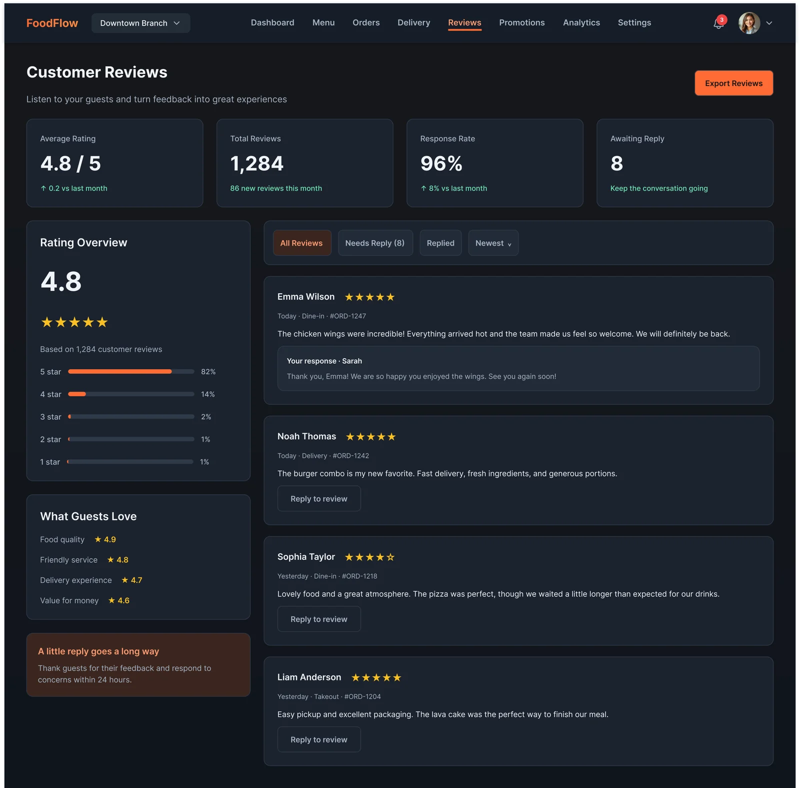
One appetising orange for actions and the main data series, on a warm off-white page with soft rounded cards. Food photography does the emotional work, while green, amber and blue are reserved for order status.
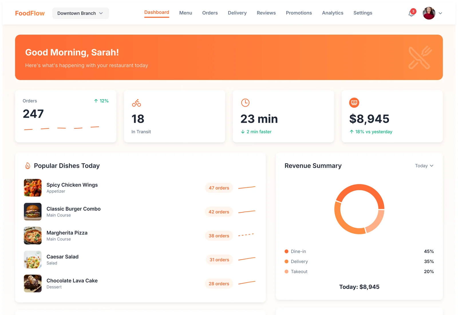
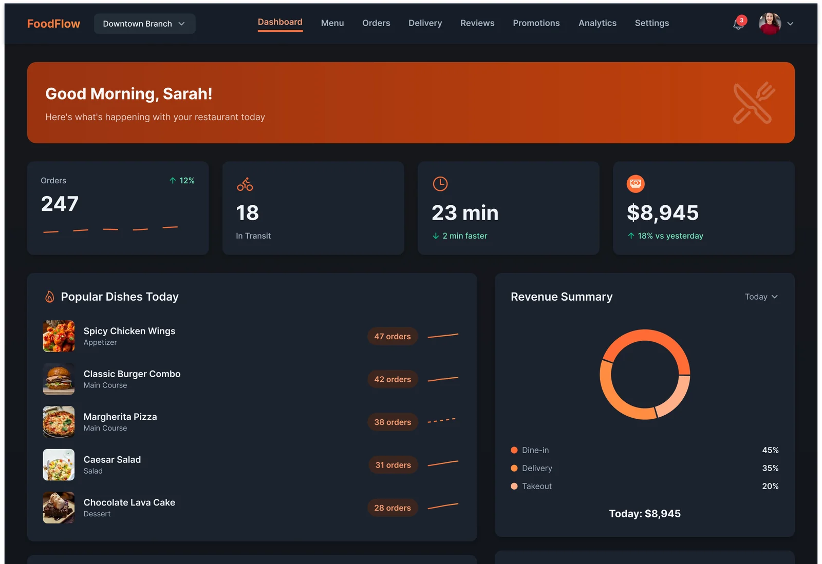
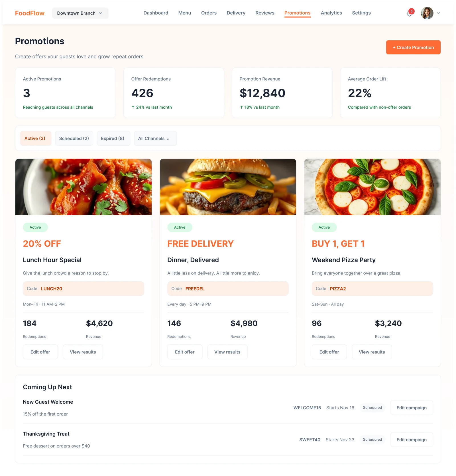
Status has its own colours
Green, amber and blue for order states, never mixed up with the brand orange.
Big touch targets
Switches, chips and buttons sized for a tablet next to the kitchen.
Warm, not loud
Orange is used for actions and highlights only; the rest is calm and neutral.
10Usability testing & iterations
Task success, first round vs. after changes
Illustrative resultsModerated sessions with restaurant owners and shift managers on a tablet prototype. Numbers below show how a test round would be reported.
Mark the Grilled Salmon as sold out
Before65%After98%Find the order that's been preparing longest
Before50%After92%Reply to the newest review
Before60%After95%
What we saw
Availability was hidden in an edit form.
What changed
Put an availability switch directly on each dish card.
Why
During service, one tap is the only acceptable cost.
What we saw
Order status badges were hard to tell apart in dark mode.
What changed
Tuned status colours for both themes and added text labels inside badges.
Why
Status must be readable at a glance in any light.
What we saw
Owners never opened the reviews page.
What changed
Added a 'Needs reply' count and a tip card: 'A little reply goes a long way'.
Why
A visible count turns reviews into a small daily task.
11Final outcomes
FoodFlow replaces a pile of tablets and paper with one warm, clear workspace: a morning snapshot, a menu that can change mid-service, and every order visible from kitchen to doorstep.
1 tap
to mark a dish available or sold out
8
sections in one flat navigation
3
status colours, kept separate from the brand
Key takeaways
- Design for the busiest moment (the rush), and the calm moments get easier too.
- Separating status colours from the brand colour avoids costly confusion.
- Small nudges (a count, a tip) build habits like answering reviews.
What I would do next
- Design a kitchen display mode for the order queue.
- Test on real tablets during a lunch service.
- Add multi-branch comparisons for restaurant groups.