Techno UX case study
An electronics store, from research to final design: problem, personas, journey map, user flows, information architecture, wireframes, UI and usability testing.
- Role
- UX/UI designer
- Year
- 2025
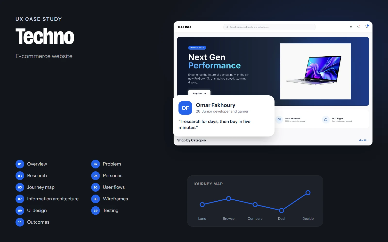
The screens, flows and structure on this page come from the real Techno design. Research findings, personas' quotes, test results and numbers are illustrative examples of how I run each step; they are marked Illustrative and are not data from a real study.
01Project overview
Background
Buying electronics online means spending a lot on something you can't touch. Shoppers compare specs, prices and warranties across several tabs before trusting a store. Techno is an electronics store designed to earn that trust quickly, and to make finding the right device fast.
Objectives
- Help shoppers find a device by category or search in a few clicks.
- Answer trust questions (shipping, warranty, payment, support) before they're asked.
- Make deals feel honest: real old and new prices, real stock levels.
- Offer light and dark themes that both show products well.
Challenges
- Large catalogue with very different products: phones, cameras, consoles, drones.
- Deals and urgency can easily feel manipulative.
- Product photos must look good on both light and dark backgrounds.
Project at a glance
- Role
- UX/UI designer
- Platform
- Responsive website
- Pages
- Home and categories, light and dark
- Deliverables
- Research, flows, wireframes, UI kit
- Tool
- Figma
02Problem statement
Problem statement
Shoppers want to buy electronics online with confidence, but most stores bury the trust signals, overload the homepage with banners, and use fake urgency that makes deals harder to believe.
When trust is low, people leave to compare elsewhere and often buy from a bigger marketplace. Techno has to feel premium and trustworthy from the first screen.
How might we…
- …show trust signals before the first product?
- …make deals feel urgent but honest?
- …help people find the right category in one click?
03UX research
Target audience
Tech-savvy shoppers aged 18–45 buying phones, laptops, audio and gaming gear, from first-time buyers to enthusiasts upgrading their setup.
Competitor teardown
Reviewing leading electronics stores' homepages, category pages and product cards.
Shopper interviews
Asking recent buyers what made them trust (or abandon) an online electronics store.
Heuristic review
Evaluating product cards and deal sections against usability heuristics and e-commerce best practice.
Key insights
Illustrative findingsINSIGHT 01
Trust before product
Warranty, shipping cost and returns are checked before people even browse.
“If I don't see the warranty, I don't buy.”
INSIGHT 02
Fake timers backfire
Countdown timers without real stock information make deals look like tricks.
INSIGHT 03
Categories beat menus
Large visual category tiles are faster than nested mega-menus for most shoppers.
INSIGHT 04
Cards need the same anatomy
Shoppers compare quickly when every card shows rating, name and price in the same place.
04User personas
Omar Fakhoury
Primary26 · Junior developer and gamer · Beirut
“I research for days, then buy in five minutes.”
Omar is upgrading his setup: a new laptop and headphones. He compares specs and prices obsessively, then buys from the store he trusts most.
Goals
- Find the right model fast
- Get a fair deal
- Be sure about warranty and delivery
Frustrations
- Hidden shipping costs
- Fake 'only 2 left' messages
- Inconsistent product info
Habits
- Browses at night in dark mode
- Watches deal sections
- Reads ratings before buying
Lina Jaber
Secondary44 · Accountant and parent · Jounieh
“I just want a good tablet for my son, from a store I can trust.”
Lina buys electronics for the family a few times a year. She isn't interested in specs, but wants clear prices, a warranty and help if something goes wrong.
Goals
- Find the right category quickly
- Understand the price and warranty
- Know that support is available
Frustrations
- Technical jargon
- Crowded homepages
- Unclear return policies
Habits
- Shops on weekends
- Prefers light mode
- Calls support before big purchases
05User journey map
Omar: looking for new noise-cancelling headphones during a deal week.
Doing
Arrives on the homepage from a social ad.
Thinking
“Is this store legit?”
Pain point
Unknown stores feel risky.
Opportunity
Trust strip right after the hero: shipping, warranty, secure payment, support.
Select a stage, or a face on the curve, to see what the person is doing, thinking and feeling.
06User flows
The main paths through the product, from the first tap to the goal. Decisions show where the path can branch.
Goal: Find and add a product to the cart through categories.
- Homepage
- Shop by Category
- Category page
- Sort and filter
- Found it?No: search instead
- Product page
- Add to cart
07Information architecture
Home
- Hero launch
- Trust strip
- Shop by category
- Deal of the Day
- Featured products
- Feature banner
Categories
- Smartphones
- Laptops & computers
- Gaming & consoles
- Audio
- Wearables
- Cameras
- Smart home
- Accessories
Product
- Gallery
- Price and deal
- Specs
- Reviews
- Warranty and delivery
Account
- Orders
- Wishlist
- Addresses
- Payment
Support
- Help center
- Order status
- Returns & warranty
- Contact
The header keeps search in the centre with account, wishlist and cart on the right. The footer repeats Shop, Support and newsletter links so every page has an exit to help.
08Wireframes
Low-fidelity layouts came first, to agree on structure and priorities before any colour or type.
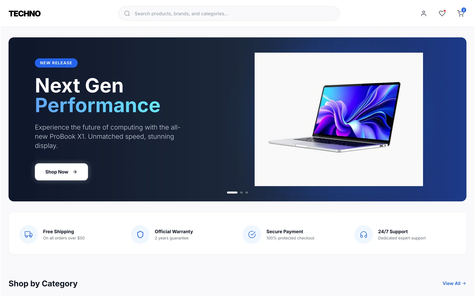
Annotations
- 1One product story at a time, with a single call to action.
- 2Four trust promises right after the hero, before any product.
Drag across the screen to go from the low-fidelity sketch to the final design.
09UI design
Clean and technical: generous white or deep-navy space, product photos on soft grey wells, and one electric blue for every action. A blue-to-cyan gradient on the hero's key word adds energy without adding colours.
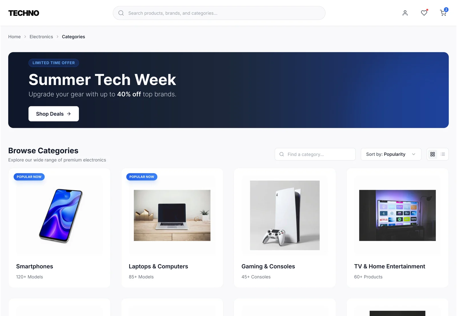
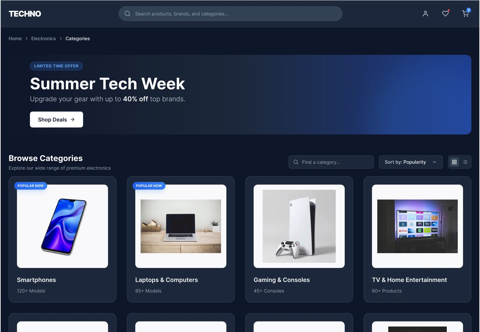
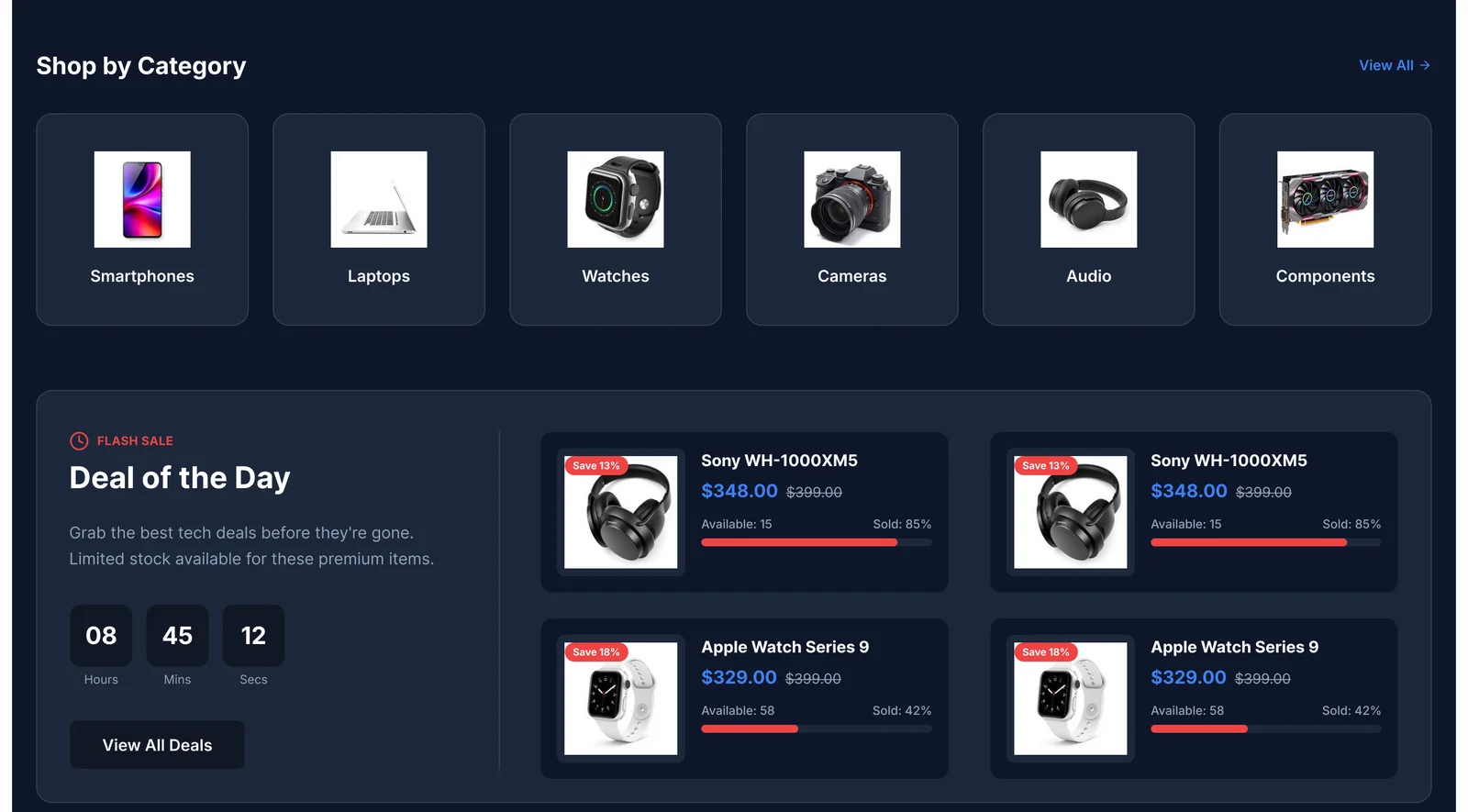
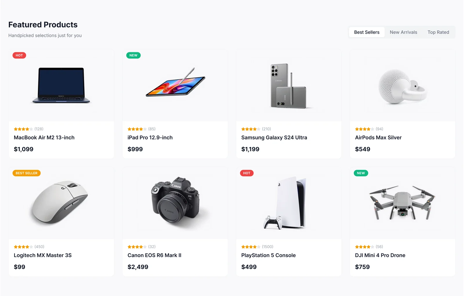
Products on neutral wells
Devices always sit on a light grey well, so they look right in both themes.
Badges are rare and loud
Hot, New and Best Seller use small saturated pills; everything else stays calm.
Honest urgency
Deals show the old price, the new price and the real stock level.
10Usability testing & iterations
Task success, first round vs. after changes
Illustrative resultsUnmoderated first-click and task tests on the homepage and category prototypes. Numbers below show how a test round would be reported.
Find the warranty and delivery terms
Before50%After94%Go to the Audio category
Before70%After97%Tell if the deal is still in stock
Before45%After90%
What we saw
Shoppers looked for warranty and shipping in the footer.
What changed
Added a trust strip with four icons right after the hero.
Why
Trust questions come before browsing, so the answers should too.
What we saw
The countdown alone made deals look fake.
What changed
Added old price, discount, a stock bar and 'Sold: 65%' to each deal card.
Why
Real information makes urgency believable.
What we saw
Product images looked too bright on the dark theme.
What changed
Kept product images on light wells inside dark cards.
Why
Devices should look the same as in real life, whatever the theme.
11Final outcomes
Techno feels premium and trustworthy: shoppers see the store's promises first, find categories in one click, and can believe the deals they see.
4
trust promises shown before any product
1
card anatomy for every product in the catalogue
2
themes that show products the same way
Key takeaways
- In e-commerce, trust is a layout decision, not just copy.
- Urgency only works when it's backed by real information.
- A strict card anatomy makes a varied catalogue feel like one store.
What I would do next
- Design the product detail page and checkout.
- A/B test the trust strip position against conversion.
- Add product comparison for up to three devices.